Wednesday, October 31, 2018

RELEASE: New Analysis Reveals High Costs, Low Reward on Carbon Tax Proposals

WASHINGTON, D.C. — Today the Institute for Energy Research released a study that delivers a sobering economic analysis of six carbon tax scenarios, including one that mirrors the tax-and-rebate scheme proposed by the Climate Leadership Council.

The analysis, commissioned by IER and conducted by Capital Alpha Partners, LLC, uses standard scoring conventions (similar to those used by JCT, CBO and Treasury) to evaluate and model the economic impacts of carbon taxes set at a variety of dollar figures, with different phase-in durations, and with an array of revenue-recycling strategies.

The key findings include:

  •  A carbon tax will not be pro-growth. Most carbon tax scenarios reduce GDP for the entirety of the 22-year forecast period. Better than break-even economic performance may not be possible unless revenue is devoted entirely to corporate tax relief. A lump-sum rebate results in lost GDP equal to between $3.76 trillion and $5.92 trillion over the 22-year forecast period.
  • A carbon tax is not an efficient revenue raiser for tax reform. Using standard scoring conventions, a carbon tax is likely to only produce net revenue available for tax reform of 32 cents on the dollar.
  • No carbon tax modeled is consistent with meeting the long-term U.S. Paris Agreement INDC. As a standalone policy, consistent with World Bank and IEA estimates, all carbon tax scenarios analyzed are far off of the trajectory the Paris Agreement sets for 2040, undermining claims that a tax-for-regulation swap will satisfy emissions commitments.
  • Depressed GDP leads to long-term fiscal challenges, with particular stress on states. Persistent reductions in economic performance lead to trillions of dollars in lost GDP, thereby reducing state tax revenues and straining state budgets. The average annual burden on the states and local government during the first 10 years of the tax would range from $18.9 to $30.6 billion.


Figure 4.3.2-1

Institute for Energy Research President Thomas J. Pyle made the following statement:

“The release of this analysis comes at an important time as numerous carbon tax proposals arise in Washington and are being considered for introduction in Congress. This study shows that when carbon tax scenarios are subject to the same scrutiny as an actual legislative proposal, it is all pain and no gain for the overall economy, with the states, in particular, being significantly impacted.

“Despite claims from carbon tax advocates, this analysis shows that a carbon tax will not improve our environment or U.S. fiscal stability in any meaningful way. In other words, carbon taxes are bad fiscal and environmental policy. Any member of Congress that lends their name to proposals like the one put forth by the Climate Leadership Council would essentially be taxing American families and small businesses, undermining our economic recovery, negatively impacting state governments, and increasing government spending, all while doing virtually nothing to improve the environment.”

The full study can be viewed here.

For the key takeaways, click here.

For further analysis from Senior Economist at IER, Robert Murphy, click here.

###

For media inquiries, please contact Erin Amsberry
eamsberry@ierdc.org

The post RELEASE: New Analysis Reveals High Costs, Low Reward on Carbon Tax Proposals appeared first on IER.

New Study Shows Flaws in Carbon Tax Deal

An important new study from Capital Alpha Partners, LLC uses standard budget-scoring rules to show carbon tax “deals” won’t live up to their promises to positively stimulate economic growth by providing new revenue for pro-growth tax cuts. Once we account for the loss in other tax receipts from a new carbon tax and the need to compensate poorer households, the net revenues available for tax reform are only 32 cents on the dollar. Thus, the proposals for using a carbon tax to engage in an ostensibly pro-growth tax swap are overstating how much in other tax cuts will be available, after the imposition of a new carbon tax.

The IER-commissioned study is entitled “The Carbon Tax: An Analysis of Six Potential Scenarios.” It looks at various levels and phase-in schedules for a carbon tax, and at various methods of using the revenue from a new carbon tax. The study concludes that in only one scenario—where all of the revenues from a new carbon tax are used to reduce corporate income taxes—does the economy benefit. In all other scenarios evaluated, including one that matches the Climate Leadership Council (CLC) proposal to start with a $40 per ton carbon tax and refund all revenues in a lump-sum fashion to taxpayers, the study finds that the economy takes a massive hit. Under the scenario most similar to the CLC proposal, GDP is held more than 1 percent below trend for almost a decade. Over the first ten years, the cumulative GDP shortfall is some $2.9 trillion.

To add insult to injury, the study shows that even with such negative impacts on the conventional economy, a carbon tax of any politically plausible magnitude would not lead the U.S. to achieve the targets of the Paris Climate Agreement. For all of these reasons, conservatives and libertarians should be very wary of those boosting the CLC proposal and others like it. A new carbon tax wouldn’t generate enough net revenue for a meaningful “tax swap,” which would slow economic growth while still allowing for more carbon dioxide emissions than interventionists are saying is acceptable.

Budget Scoring

The most important innovation in the new Capital Alpha Partners study is its application of conventional budget-scoring procedures to a hypothetical new carbon tax. The shocking conclusion: After accounting for the loss of other tax receipts and the need to compensate poorer households, there is only 32 cents to the dollar available for “reform.”

For full details, the interested reader should turn to the discussion in the actual study. But to summarize some of the main points here:

  • Following the convention of the Joint Committee on Taxation (JCT), the Congressional Budget Office (CBO), and the Treasury, 25 percent of the gross revenue from a new excise tax is deducted to yield the net revenue available, because of the reduction in other tax categories flowing from the new excise tax.
  • Following CBO’s handling of the issue when it analyzed the Waxman-Markey bill, another 13 percent of the gross revenue from a new carbon tax is “lost” because federal, state, and local governments themselves are large consumers of energy, and hence will have higher expenses due to a carbon tax. In other words, to the extent that government itself is paying a portion of the revenues received under a new carbon tax, we can’t count those particular receipts as being available for a lump-sum dividend or other tax cut. If the government takes money out of its left pocket and puts it in the right pocket, the government doesn’t suddenly have new money available for tax reform—especially when the pockets have holes in them.
  • Also following CBO, the study assumes that 27 percent of gross revenue from a new carbon tax will be needed to keep the bottom two quintiles held harmless from higher energy prices under a carbon tax.

The above considerations are quite orthodox, and yet we have already “spent” 65 percent of the gross receipts from a new carbon tax. This is why proposals to use a new carbon tax to fund “green energy” investments and provide “supply-side tax cuts” are illusory; there’s simply not enough money to go around when real math is substituted for talking points.

The CLC-Like Scenario

The Capital Alpha study looks at different scenarios of the magnitude and phase-in schedule of a carbon tax, as well as the possible uses of the new revenue. The scenario closest to the Climate Leadership Council (CLC) proposal involves an initial $40 per ton carbon tax that then rises by 2 percent (in real terms) annually. Furthermore, it is revenue-neutral, with all net proceeds being returned to citizens in a lump-sum fashion. Finally, we note that the Capital Alpha analysis bends over backward to be generous; many of the issues discussed in the previous section are ignored, meaning that the following analysis assumes more “net” proceeds will be available for the lump-sum refund than will actually exist.

Even so, the results below show just how badly a new carbon tax will hit the economy, even with all proceeds being refunded in lump-sum fashion:

Figure 4.3.2-1

As the chart shows, all six of the various carbon tax profiles depress economic growth relative to the no-tax baseline, when the net proceeds are refunded in lump-sum fashion. In particular, the blue line (showing an initial tax of $40 per ton) is similar to the CLC proposal. Notice that the blue line is below the -1.0% horizontal bar for about nine years after implementation.

To get a sense of the cumulative medium-term impact, consider the following table taken from the study:

Table 4.3.1-1

Consider in particular the 5th column, which shows the results of an initial $40 per ton carbon tax with lump-sum rebate. (To repeat, this is the closest scenario to the CLC proposal.) The 10-year cumulative GDP gap is some $2.9 trillion. In present value terms (in which future dollars do not weigh as heavily as current dollars), the 10-year GDP gap is still an enormous $1.9 trillion. If we look further out, the net present value of the 22-year GDP gap is $3.1 trillion.

Conclusion

An important new study from Capital Alpha Partners applies conventional budget-scoring rules to currently fashionable carbon tax proposals. The study finds that there are only 32 cents on the dollar available for “tax reform,” meaning that the proposals to impose a new carbon tax that won’t hurt the poor and will promote economic growth are simply impossible, as a matter of accounting.

When the study explicitly models a carbon tax proposal starting at $40 per ton and gradually increasing, with all net proceeds being refunded in a lump-sum fashion, this is very similar to the Climate Leadership Council proposal. Yet the study concludes that this approach would cause a cumulative GDP gap over the first ten years of $2.9 trillion ($1.9 trillion in net present value terms). On top of hurting economic growth, this carbon tax scenario wouldn’t even come close to leading the U.S. to hit its original targets in the Paris Climate Agreement.

The new study from Capital Alpha Partners underscores just how flimsy are the “conservative” carbon tax proposals. The math simply doesn’t add up. Once we account for the loss in other tax receipts and the need to compensate poorer households, there isn’t enough left for “reform” that could protect the economy from the hit to consumers of energy and transportation caused by the carbon tax.

The post New Study Shows Flaws in Carbon Tax Deal appeared first on IER.

The Carbon Tax: Analysis of Six Potential Scenarios


The Carbon Tax: Analysis of Six Potential Scenarios is a study commissioned by IER and conducted by Capital Alpha Partners. The analysis uses standard scoring conventions (similar to those used by JCT, CBO and Treasury) to evaluate and model the economic impacts of carbon taxes set at a variety of dollar figures, with different phase-in durations, and with an array of revenue-recycling strategies.

The key findings include:

  •  A carbon tax will not be pro-growth. Most carbon tax scenarios reduce GDP for the entirety of the 22-year forecast period. Better than break-even economic performance may not be possible unless revenue is devoted entirely to corporate tax relief. A lump-sum rebate results in lost GDP equal to between $3.76 trillion and $5.92 trillion over the 22-year forecast period.
  • A carbon tax is not an efficient revenue raiser for tax reform. Using standard scoring conventions, a carbon tax is likely to only produce net revenue available for tax reform of 32 cents on the dollar.
  • No carbon tax modeled is consistent with meeting the long-term U.S. Paris Agreement INDC. As a standalone policy, consistent with World Bank and IEA estimates, all carbon tax scenarios analyzed are far off of the trajectory the Paris Agreement sets for 2040, undermining claims that a tax-for-regulation swap will satisfy emissions commitments.
  • Depressed GDP leads to long-term fiscal challenges, with particular stress on states. Persistent reductions in economic performance lead to trillions of dollars in lost GDP, thereby reducing state tax revenues and straining state budgets. The average annual burden on the states and local government during the first 10 years of the tax would range from $18.9 to $30.6 billion.

Key Takeaways One Pager

Read the full PDF

Executive Summary

We present a macroeconomic analysis of current representative carbon tax proposals considered as if they were actual legislative proposals before Congress and scored using scoring conventions similar to those used by the Joint Committee on Taxation (JCT), the Congressional Budget Office (CBO) and the U.S. Treasury Department Office of Tax Analysis (Treasury).

We model six carbon tax scenarios. Two are carbon taxes that begin at a set rate and increase annually. These taxes begin at $40 and $49 dollars per metric ton of CO2 and increase annually by 2%. Four are carbon taxes that phase in over time to a terminal value. These are taxes with terminal values of $36, $72, $108, and $144 per ton. All are in constant 2015 dollars.

A special focus of our study is the role of a carbon tax as a revenue raiser in pro-growth tax reform. There have been many suggestions that a “tax swap” of growth-oriented tax cuts financed by a carbon tax could produce incremental economic growth. We find that this premise would be difficult to achieve using standard scoring conventions. We also examine the possibility of a tax-for-regulatory swap in which a carbon tax would replace all existing regulation and still allow the United States to meet its obligations under the Paris Agreement. We find this premise difficult to achieve as well. A carbon tax would reduce emissions but could still only achieve Paris Agreement obligations as a part of a comprehensive carbon mitigation plan. This is in agreement with World Bank and International Energy Agency (IEA) conclusions and is consistent with the Treasury’s own modeling.

In particular, we find that:

  • A carbon tax is not an efficient revenue raiser for tax reform. Using standard scoring conventions and assuming that Congress would protect tax payers in the lowest two income quintiles from a tax increase, a carbon tax produces net revenue available for tax reform of only 32 cents on the dollar. Net revenue decreases still further when considerations such as federalism and revenue sharing come into play.
  • A carbon tax pushes static costs and revenue burdens on to the states and local government. Based on JCT and CBO estimates, we find that static costs and revenue burdens equal to 11% of federal gross revenues from a carbon tax would flow through to the states and local government. In the scenarios we study, the average annual burden on the states and local government during the first 10 years of the tax would range from $18.9 to $30.6 billion in constant 2015 dollars. Dynamic revenue losses to the states and local government could make the total costs higher.
  • No carbon tax we model is consistent with meeting long-term U.S. obligations under the Paris Agreement as a standalone policy. Two scenarios, phased-in taxes of $72 and $108 per ton, are capable of meeting the U.S. minimum Intended Nationally Determined Contribution (INDC) for 2025. Other scenarios achieve meaningful reductions, but all are far off the trajectory Paris requires by 2040, a finding which is also consistent with World Bank and IEA estimates.
  • Vertical tax competition impedes infrastructure development. Historically, all excise taxes collected on motor fuel at the federal and state level have gone to the states to finance transportation infrastructure. A federal carbon tax would raise 38% of its revenues from motor fuels. Without revenue sharing, none of this would go to the states. The federal government would collect the majority of excise tax revenues from motor fuel. All incremental revenue would go to the federal government, and states would likely be pre-empted from raising their own motor fuel taxes to finance highway construction for a period of years.
  • Carbon tax-financed tax reform is unlikely to be pro-growth. Most tax reform and tax swap scenarios modeled lead to reduced GDP relative to the reference case for the entirety of our 22-year forecast period. Better than break-even economic performance with revenue-neutral tax reform may not be possible under standard scoring conventions unless distributional concerns are completely ignored, and low-income taxpayers bear the cost of corporate tax relief.
  • Depressed GDP leads to long-term fiscal challenges. Small but persistent reductions in GDP relative to the no-tax reference case over a period of many years lead to trillions of dollars in lost production, with challenging implications for federal, state, and local government finances. Sensitivity analyses of the Budget of the United States Government conducted by the Office of Management and Budget (OMB) underscore the cost of even temporary, cyclical losses.

We consider five simple revenue-recycling strategies and three mixed revenue-recycling strategies. The simple revenue-recycling strategies direct all net revenue to a single tax reform or tax swap proposal. The mixed revenue-recycling strategies simulate a Congressional exercise in tax reform in which available net revenue is directed to more than one policy option. We find that break-even or slightly better performance relative to the no-tax reference case requires the majority of, if not all, net revenue from the carbon tax to be directed to corporate tax reform, regardless of the regressive impact this would have on lower-income taxpayers. Such tax reform may also require larger corporate tax cuts than are truly revenue-neutral given scoring constraints.

A review of studies from the World Bank and IEA put the carbon taxes we model into a global context. The carbon taxes we examine, if enacted, would be the highest economy-wide carbon taxes in the world. They would raise average annual revenues of up to nine times the total amount of carbon-related revenues collected worldwide in 2017 during their first 10 years.

In our study, we rely on standard data and projections from government sources only. These sources include the IEA, World Bank, Organization for Economic Cooperation and Development (OECD), JCT, CBO, Office of Management and Budget (OMB), Energy Information Administration (EIA), Bureau of Economic Analysis (BEA), Bureau of Labor Statistics (BLS), and Census Bureau. We perform our economic modeling with a commercial macroeconomic model that has been widely used for public-sector forecasting at the state and local level for decades. We estimate carbon tax revenues raised and carbon emissions reduced using an open- source model developed by a state government to assist in the implementation of a carbon tax.

The Carbon Tax: Analysis of Six Potential Scenarios

The post The Carbon Tax: Analysis of Six Potential Scenarios appeared first on IER.

Tuesday, October 30, 2018

Wind Farms Could Cause Surface Warming

Harvard University study suggests that, under certain conditions and in the near term, increased wind power could mean more climate warming than would be caused by the use of fossil fuels to generate electricity. The study found that if wind power supplied all U.S. electricity demands, it would warm the surface of the continental United States by 0.24 ˚C, which could significantly exceed the reduction in U.S. warming achieved by decarbonizing the nation’s electricity sector this century—around 0.1 ˚C. The warming effect depends strongly on local weather conditions, as well as the type and placement of the wind turbines.

According to the Harvard researchers, the findings closely matched directly observed effects from hundreds of U.S. wind farms. In the Harvard scenario, the warming effect from wind was 10 times greater than the climate effect from solar farms, which can also have a warming effect. The Harvard University researchers also concluded that the transition to wind or solar power in the United States would require 5 to 20 times more land than previously thought.

The Research Approach

To estimate the impacts of wind power, the researchers established a baseline for the 2012 to 2014 U.S. climate using a standard weather-forecasting model. They covered one-third of the continental United States with enough wind turbines to meet present-day U.S. electricity demand. The researchers found this scenario would warm the surface temperature of the continental United States by 0.24 degrees Celsius, with the largest changes occurring at night when surface temperatures increased by up to 1.5 degrees. This warming is the result of wind turbines actively mixing the atmosphere near the ground and aloft while simultaneously extracting from the atmosphere’s motion.

The Harvard researchers found that the warming effect of wind turbines in the continental U.S. would be larger than the effect of reduced emissions for the first century of its operation. This is because the warming effect is predominantly local to the wind farm, while greenhouse gas concentrations must be reduced globally before the benefits are realized. The direct climate impacts of wind power are instant, while the benefits of reduced emissions accumulate slowly.

According to one of the researchers, “If your perspective is the next 10 years, wind power actually has—in some respects—more climate impact than coal or gas. If your perspective is the next thousand years, then wind power has enormously less climatic impact than coal or gas.”

The U.S. Geological Survey provided the researchers with the locations of 57,636 wind turbines around the United States. Using this data and several other U.S. government databases, they were able to quantify the power density of 411 wind farms and 1,150 solar photovoltaic plants operating in the United States during 2016. For wind, the average power density—the rate of energy generation divided by the encompassing area of the wind plant—was up to 100 times lower than estimates by some energy experts because most of the latter estimates failed to consider the turbine-atmosphere interaction. For an isolated wind turbine, the interactions do not matter. For wind farms that are more than 5 to 10 kilometers deep, the interactions have a major impact on the power density.

For solar energy, the average power density (measured in watts per meter squared) is 10 times higher than wind power, but also much lower than estimates by leading energy experts, including the U.S. Department of Energy and the Intergovernmental Panel on Climate Change.

Conclusion

Clearly, the scenario developed by the Harvard researchers is unlikely to occur, i.e., the United States is unlikely to generate as much wind power as the researchers simulate in their scenario. Despite that, the researchers found that localized warming occurs in even smaller wind generation projections. Thus, the warming phenomena of wind farms is a factor that politicians, utility planners, and the public should consider when determining which technologies should be built and what subsidies should be enacted or extended.

The post Wind Farms Could Cause Surface Warming appeared first on IER.

Monday, October 29, 2018

IER Comment on Proposed SAFE Vehicles Rule

The following comment was submitted by Kenneth Stein, Director of Policy, on behalf of the Institute for Energy Research regarding Docket No. NHTSA-2018-0067.

The Institute for Energy Research generally supports the path proposed by this Notice of Proposed Rulemaking (NPRM) for model years 2021-2026.  While IER questions the ongoing need for fuel economy and related regulations, it is important that if we are going to have such regulations they be the least economically destructive possible.  IER would argue for an actual roll back of the unnecessarily high Corporate Average Fuel Economy (CAFE) mandates from the previous administration.  However, in the absence of such full relief for American consumers, the proposed path of the NPRM is an acceptable partial relief.  IER strongly argues against taking any of the weaker paths provided in the list of alternative scenarios in this NPRM.  The proposed scenario of freezing CAFE mandates at the MY 2020 levels for the five-year period is the bare minimum relief needed.

General CAFE discussion:

CAFE rules are not and were never meant to be greenhouse gas regulations.  The intent of the law creating the CAFE program, the Energy Policy and Conservation Act (EPCA) was to reduce fuel consumption in the face of national security threats.  Over time, the pace of CAFE mandate rises appropriately fell off as the national security justifications also diminished.  Even when Congress mandated CAFE increases in 2007 with the Energy Independence and Security Act (EISA), the justification was again couched in moving toward greater energy independence and security.  Developments in the last 10 years in oil and gas production mean that this rationale is completely outdated.  The continued need for CAFE mandates is an open question.  While the 2007 law, which again was passed prior to the domestic energy renaissance, does require NHTSA to set CAFE standards at the “maximum feasible” level for 2021-2030, that feasibility must be considered in the context of the changed energy landscape.  In an era of declining US production, there might be a justification for forcing vehicle costs higher in an effort to reduce consumption.  But what is considered feasible must change when there are less benefits to reducing consumption.  Maximum feasible does not mean maximum technologically possible, it means the best that can be done given market behavior, consumer preference, and cost-benefit value.

During the last administration CAFE was seized upon as an alternate avenue for regulating carbon dioxide emissions, emissions which were only dubiously regulatable under the Clean Air Act (CAA).  The previous administration attempted to combine the two tenuous carbon dioxide regulatory authorities (CAA and CAFE) to try to create a sturdier carte blanche authority to regulate carbon dioxide tailpipe emissions.  The administration then took this questionably constructed authority and morphed it into an effective electric vehicle mandate.  The CAFE mandates created by the previous administration for 2021 to 2025 are only possible to meet by the aggressive expansion of the electric vehicle fleet.  Those standards were not about achieving the “maximum feasible” fuel efficiency, as called for in the EISA, they were an attempt to forcibly remake the US vehicle market to fit the preferences of the government of the day.  It is quite appropriate that NHTSA has proposed to abandon that costly and unnecessary intervention.

Inadequacy of the so-called midterm review:

The idea of the midterm review is a regulatory fiction created by the previous administration.  By statute, NHTSA may only set CAFE standards in 5-year increments in a given rulemaking. In 2012, the Obama administration sought to set standards beyond 5 years, but included this idea of a midterm review to get around the 5-year limitation.  But instead of using the midterm review to reevaluate the CAFE standards and undertake a new rulemaking for the next 5 years, as required by law, the previous administration rushed through a sham rulemaking essentially just restating their previous decision.  NHTSA has correctly identified this deficiency and undertaken this new rulemaking.  The additional year mandates included in the 2012 rulemaking beyond the statutory 5 years should have no bearing on the current rulemaking process as they were beyond the statutory authority of the agency to determine at that time.

Since 2012, the US vehicle market has changed.  Indeed, IER would argue that this is why Congress only allows CAFE standards to be set for 5 years at a time; conditions change.  The rushed midterm review ignored these changes in an effort to ram through the administration’s ideological view of what the vehicles market should look like, and to try to bind the next administration.

What the midterm review should have acknowledged is that American consumers as a whole are not purchasing electric vehicles or small fuel-efficient vehicles.  Thus, the technical feasibility of the 2021-2025 mandates come into question, or at least they would have in a legitimate process.  If consumers are buying 2/3rds or more of vehicles as trucks and SUVs, then the question of compliance becomes even more acute. By rushing through the midterm review and insisting that car companies still comply with calculations based on outdated projections, the previous administration short-circuited the regulatory process. A novel regulatory process that the Obama administration had created in the first place.

The midterm review process also deliberately limited the opportunity for public comment in a further effort to rush through regulations before the new administration took over.  The original timetable for the midterm review foresaw several years of discussion and evaluation, with ample opportunity for public input.  Instead, the Obama administration rapidly affirmed its previous positions just in time to finalize a rulemaking before its term expired.  This process made a mockery of the notice and comment process required under the Administrative Procedure Act.  IER proposes that this arguably illegal handling of the midterm review process (which itself was already a dubiously legal mechanism) means that the conclusions reached during that sham process should not be considered controlling or even influential in this new regulatory process.

Defining maximum feasible under the EISA:

The NPRM correctly notes that CAFE mandates can only be set at the “maximum feasible” levels.  With current consumer buying patterns, the “maximum feasible” is simply not what the Obama administration thought it could be back in 2012. Consumer preference and behaviors change what constitutes “maximum feasible” levels for CAFE purposes.  Just because a vehicle technology exists does not mean that consumers wish to purchase it. The CAFE law contains no authority for technology mandates, nor can it require consumers to purchase particular vehicles.  IER argues that much of the credit system designed by the Obama administration was in effect a backdoor technology mandate.  The credit benefits given to ideologically preferred vehicles, such as all-electrics, combined with the preposterously high fuel economy mandates for the 2021-2025 period in effect left car manufacturers facing a future with no choice but to manufacture electric vehicles, even if undesired by consumers and sold at a loss, just to comply with CAFE mandates.  That situation is fundamentally contradictory to the concept of “maximum feasible” as construed in the EISA.  The credit system created under the previous rulemaking structure that artificially weighted the credit system in favor of electric vehicles should be discarded in this new rulemaking.

Since the 2012 rulemaking, consumer buying patterns have tilted even further away from small vehicles toward light trucks and SUVs.  In May of 2018 more than 2/3rds of vehicles sold were light trucks and SUVs according to JD Power, a proportion that has been seen for the last several years. These vehicles are intrinsically less fuel efficient no matter what technologies are employed.  This preference for larger vehicles has persisted even as gas prices have begun to rise again in the last year to 18 months.  The NPRM correctly notes that the EISA requires that economic practicability be factored into the calculation of “maximum feasible.”  Consumers consistently choosing to buy less fuel-efficient vehicles is the clearest example of economic impracticability possible. These voluntary consumer buying patterns require a reevaluation of maximum feasible CAFE levels.

The proposed rule also correctly notes the diminishing returns to fuel efficiency improvements. While low hanging fruit technological add-ons can achieve efficiency gains at relatively low cost, every incremental efficiency improvement requires more (and more expensive) technology, increasing the cost of a vehicle and/or requiring tradeoffs in other aspects of performance.  The increased cost or diminished performance is likely to reduce sales as consumers reject the tradeoffs.  This is another example of the economic impracticability foreseen by the EISA, and the NPRM correctly seeks to factor this effect into its calculation of maximum feasibility, since again just because it is possible a car can be made with a given level of efficiency does not mean that car will be purchased.

The NPRM correctly notes that the EISA requires that in setting the “maximum feasible” levels that there are additional factors just beyond conserving energy.  One of these factors, which the NPRM does not address, is “the effect of other motor vehicle standards of the Government on fuel economy.” IER proposes that another motor vehicle standard of the federal government has a significant impact on CAFE maximum feasibility, namely the Renewable Fuel Standard (RFS).  Ethanol per unit of volume provides less energy than an equal unit of gasoline, thus ethanol reduces the fuel economy sought by CAFE regulations.  In the past, this effect has not been addressed in the regulatory process for the CAFE program, however the increasing share of the fuel supply made up of ethanol, nearly 10% at present with legislative and regulatory efforts to increase that share, requires that this fuel inefficiency must considered in calculation of maximum feasibility.  The RFS can affect CAFE compliance in additional ways as well.  Manufacturing cars that can handle higher blends of ethanol increases their cost, which as the NPRM notes (though regarding different context) reduces purchases of newer, more efficient cars.  Further, some of the technologies that might otherwise be deployed to increase fuel economy can end up having to be deployed to compensate for ethanol’s inefficiency in order to maintain the performance that consumers expect from modern vehicles.  IER calls for NHTSA and EPA to analyze the effect of the increasing percentage of ethanol has on maximum feasible fuel economy and consider downward revisions to compensate for that effect.

Legal grounds for revoking California waiver:

The enabling law which created the CAFE program very clearly states any law or regulation “related to” fuel efficiency is preempted by federal fuel efficiency law.  As the NPRM correctly notes, carbon dioxide emissions from vehicles are directly related to fuel efficiency because the only way to reduce carbon dioxide emissions from cars is to reduce fuel consumption.  There is no catalytic convertor for carbon dioxide. Fuel consumption has an almost one-to-one ratio with carbon dioxide emissions, to control one is to control the other.  Thus, the California waiver authority in the CAA does not and cannot apply to carbon dioxide vehicle tailpipe regulations.

Claims of state regulatory authority are irrelevant in the situation as presented currently. Whatever one thinks of its wisdom, the EPCA clearly preempted state authority regarding fuel economy or regulations related to fuel economy.  The only route to allowing California (or other states) to regulate fuel economy is to amend or repeal the provisions of the EPCA creating the CAFE program.  California may continue to seek waivers for pollutant regulations under the Clean Air Act, but it cannot seek waivers for fuel efficiency mandates such its tailpipe carbon dioxide regulations or its ZEV program. Put simply, waivers for such regulations are explicitly barred by statute.

EPA carbon dioxide endangerment finding:

IER is disappointed that EPA has chosen to ignore this opportunity to revisit the tenuous endangerment finding for tailpipe carbon dioxide emissions imposed by the previous administration.  The process by which that determination was made does not meet the requirements of the CAA and the APA.  EPA simply assumed the conclusions it wanted, ignoring the uncertainty of projections, alternate drivers of global warming, the benefits to plant life of carbon dioxide in the atmosphere, the benefits of possibly warmer temperatures to humans, and more.  The last 10 years have brought new research which should be considered in whether carbon dioxide should be considered a dangerous pollutant under the CAA.  A diffuse, trace gas which does not harm humans when inhaled at any ambient concentrations does not meet the CAA definition of a “dangerous pollutant.”

Ignoring the ideologically motivated labelling of carbon dioxide as a “dangerous pollutant” undermines the stated intent of this rulemaking, which is to maximize net benefits. The “appropriate” regulation of carbon dioxide tailpipe emissions should be no regulation.  IER calls on the EPA to reevaluate whether carbon dioxide even qualifies as a “dangerous pollutant” for the purposes of the CAA.

The post IER Comment on Proposed SAFE Vehicles Rule appeared first on IER.

Building Links with Great Content - Natural Syndication Networks

Posted by KristinTynski

The debate is over and the results are clear: the best way to improve domain authority is to generate large numbers of earned links from high-authority publishers.

Getting these links is not possible via:

  • Link exchanges
  • Buying links
  • Private Blog Networks, or PBNs
  • Comment links
  • Paid native content or sponsored posts
  • Any other method you may have encountered

There is no shortcut. The only way to earn these links is by creating content that is so interesting, relevant, and newsworthy to a publisher’s audience that the publisher will want to write about that content themselves.

Success, then, is predicated on doing three things extremely well:

  1. Developing newsworthy content (typically meaning that content is data-driven)
  2. Understanding who to pitch for the best opportunity at success and natural syndication
  3. Writing and sending pitches effectively

We’ve covered point 1 and point 3 on other Moz posts. Today, we are going to do a deep dive into point 2 and investigate methods for understanding and choosing the best possible places to pitch your content. Specifically, we will reveal the hidden news syndication networks that can mean the difference between generating less than a handful or thousands of links from your data-driven content.

Understanding News Syndication Networks

Not all news publishers are the same. Some publishers behave as hubs, or influencers, generating the stories and content that is then “picked up” and written about by other publishers covering the same or similar beats.

Some of the top hubs should be obvious to anyone: CNN, The New York Times, BBC, or Reuters, for instance. Their size, brand authority, and ability to break news make them go-to sources for the origination of news and some of the most common places journalists and writers from other publications go to for story ideas. If your content gets picked up by any of these sites, it’s almost certain that you will enjoy widespread syndication of your story to nearly everywhere that could be interested without any intervention on your part.

Unfortunately, outside of the biggest players, it’s often unclear which other sites also enjoy “Hub Status,” acting as a source for much of the news writing that happens around any specific topic or beat.

At Fractl, our experience pitching top publishers has given us a deep intuition of which domains are likely to be our best bet for the syndication potential of content we create on behalf of our clients, but we wanted to go a step further and put data to the question. Which publishers really act as the biggest hubs of content distribution?

To get a better handle on this question, we took a look at the link networks of the top 400 most trafficked American publishers online. We then utilized Gephi, a powerful network visualization tool to make sense of this massive web of links. Below is a visualization of that network.

An interactive version is available here.

Before explaining further, let’s detail how the visualization works:

  • Each colored circle is called a node. A node represents one publisher/website
  • Node size is related to Domain Authority. The larger the node, the more domain authority it has.
  • The lines between the nodes are called edges, and represent the links between each publisher.
  • The strength of the edges/links corresponds to the total number of links from one publisher to another. The more links from one publisher to another, the stronger the edge, and the more “pull” exerted between those two nodes toward each other.
  • You can think of the visualization almost like an epic game of tug of war, where nodes with similar link networks end up clustering near each other.
  • The colors of the nodes are determined by a “Modularity” algorithm that looks at the overall similarity of link networks, comparing all nodes to each other. Nodes with the same color exhibit the most similarity. The modularity algorithm implemented in Gephi looks for the nodes that are more densely connected together than to the rest of the network

Once visualized, important takeaways that can be realized include the following:

  1. The most “central” nodes, or the ones appearing near the center of the graph, are the ones that enjoy links from the widest variety of sites. Naturally, the big boys like Reuters, CNN and the NYTimes are located at the center, with large volumes of links incoming from all over.
  2. Tight clusters are publishers that link to each other very often, which creates a strong attractive force and keeps them close together. Publishers like these are often either owned by the same parent company or have built-in automatic link syndication relationships. A good example is the Gawker Network (at the 10PM position). The closeness of nodes in this network is the result of heavy interlinking and story syndication, along with the effects of site-wide links shared between them. A similar cluster appears at the 7PM position with the major NBC-owned publishers (NBC.com, MSNBC.com, Today.com, etc.). Nearby, we also see large NBC-owned regional publishers, indicating heavy story syndication also to these regional owned properties.
  3. Non-obvious similarities between the publishers can also be gleaned. For instance, notice how FoxNews.com and TMZ.com are very closely grouped, sharing very similar link profiles and also linking to each other extensively. Another interesting cluster to note is the Buzzfeed/Vice cluster. Notice their centrality lies somewhere between serious news and lifestyle, with linkages extending out into both.
  4. Sites that cover similar themes/beats are often located close to each other in the visualization. We can see top-tier lifestyle publishers clustered around the 1PM position. News publishers clustered near other news publishers with similar political leanings. Notice the closeness of Politico, Salon, The Atlantic, and The Washington Post. Similarly, notice the proximity of Breitbart, The Daily Caller, and BizPacReview. These relationships hint at hidden biases and relationships in how these publishers pick up each other’s stories.

A More Global Perspective

Last year, a fascinating project by Kalev Leetaru at Forbes looked at the dynamics Google News publishers in the US and around the world. The project leveraged GDelt’s massive news article dataset, and visualized the network with Gephi, similarly to the above network discussed in the previous paragraph.

This visualization differs in that the link network was built looking only at in-context links, whereas the visualization featured in the previous paragraph looked at all links. This is perhaps an even more accurate view of news syndication networks because it better parses out site-wide links, navigation links, and other non-context links that impact the graph. Additionally, this graph was generated using more than 121 million articles from nearly every country in the world, containing almost three-quarters of a billion individual links. It represents one of the most accurate pictures of the dynamics of the global news landscape ever assembled.

Edge weights were determined by the total number of links from each node to each other node. The more links, the stronger the edge. Node sizes were calculated using Pagerank in this case instead of Domain Authority, though they are similar metrics.

Using this visualization, Mr. Leetaru was able to infer some incredibly interesting and potentially powerful relationships that have implications for anyone who pitches mainstream publishers. Some of the most important include:

  1. In the center of the graph, we see a very large cluster. This cluster can be thought of as essentially the “Global Media Core,” as Mr. Leetaru puts it. Green nodes represent American outlets. This, as with the previous example, shows the frequency with which these primary news outlets interlink and cover each other’s stories, as well as how much less frequently they cite sources from smaller publications or local and regional outlets.
  2. Interestingly, CNN seems to play a unique role in the dissemination to local and regional news. Note the many links from CNN to the blue cluster on the far right. Mr. Leetaru speculates this could be the result of other major outlets like the NYTimes and the Washington Post using paywalls. This point is important for anyone who pitches content. Paywalls should be something taken into consideration, as they could potentially significantly reduce syndication elsewhere.
  3. The NPR cluster is another fascinating one, suggesting that there is heavy interlinking between NPR-related stories and also between NPR and the Washington Post and NYTimes. Getting a pickup on NPR’s main site could result in syndication to many of its affiliates. NYTimes or Washington Post pickups could also have a similar effect due to this interlinking.
  4. For those looking for international syndication, there are some other interesting standouts. Sites like NYYibada.com cover news in the US. They are involved with Chinese language publications, but also have versions in other languages, including English. Sites like this might not seem to be good pitch targets, but could likely be pitched successfully given their coverage of many of the same stories as US-based English language publications.
  5. The blue and pink clusters at the bottom of the graph are outlets from the Russian and Ukrainian press, respectively. You will notice that while the vast majority of their linking is self-contained, there seem to be three bridges to international press, specifically via the BBC, Reuters, and AP. This suggests getting pickups at these outlets could result in much broader international syndication, at least in Eastern Europe and Russia.
  6. Additionally, the overall lack of deep interlinking between publications of different languages suggests that it is quite difficult to get English stories picked up internationally.
  7. Sites like ZDnet.com have foreign language counterparts, and often translate their stories for their international properties. Sites like these offer unique opportunities for link syndication into mostly isolated islands of foreign publications that would be difficult to reach otherwise.

I would encourage readers to explore this interactive more. Isolating individual publications can give deep insight into what syndication potential might be possible for any story covered. Of course, many factors impact how a story spreads through these networks. As a general rule, the broader the syndication network, the more opportunities that exist.

Link Syndication in Practice

Over our 6 years in business, Fractl has executed more than 1,500 content marketing campaigns, promoted using high-touch, one-to-one outreach to major publications. Below are two views of content syndication we have seen as a result of our content production and promotion work.

Let’s first look just at a single campaign.

Recently, Fractl scored a big win for our client Signs.com with our “Branded in Memory” campaign, which was a fun and visual look at how well people remember brand logos. We had the crowd attempt to recreate well-known brand logos from memory, and completed data analysis to understand more deeply which brands seem to have the best overall recall.

As a result of strategic pitching, the high public appeal, and the overall "coolness" factor of the project, it was picked up widely by many mainstream publications, and enjoyed extensive syndication.

Here is what that syndication looked like in network graph form over time:

If you are interested in seeing and exploring the full graph, you can access the interactive by clicking on the gif above, or clicking here. As with previous examples, node size is related to domain authority.

A few important things to note:

  • The orange cluster of nodes surrounding the central node are links directly to the landing page on Signs.com.
  • Several pickups resulted in nodes (publications) that themselves generated many numbers of links pointing at the story they wrote about the Signs.com project. The blue cluster at the 8PM position is a great example. In this case it was a pickup from BoredPanda.com.
  • Nodes that do not link to Signs.com are secondary syndications. They pass link value through the node that links to Signs.com, and represent an opportunity for link reclamation. Fractl follows up on all of these opportunities in an attempt to turn these secondary syndications into do-follow links pointing directly at our client’s domain.
  • An animated view gives an interesting insight into the pace of link accumulation both to the primary story on Signs.com, but also to the nodes that garnered their own secondary syndications. The GIF represents a full year of pickups. As we found in my previous Moz post examining link acquisition over time, roughly 50% of the links were acquired in the first month, and the other 50% over the next 11 months.

Now, let’s take a look at what syndication networks look like when aggregated across roughly 3 months worth of Fractl client campaigns (not fully comprehensive):

If you are interested in exploring this in more depth, click here or the above image for the interactive. As with previous examples, node size is related to domain authority.

A few important things to note:

  1. The brown cluster near the center labeled “placements” are links pointing back directly to the landing pages on our clients’ sites. Many/most of these links were the result of pitches to writers and editors at those publications, and not as a result of natural syndication.
  2. We can see many major hubs with their own attached orbits of linking nodes. At 9PM, we see entrepreneur.com, at 12PM we see CNBC.com, 10PM we see USAToday, etc.
  3. Publications with large numbers of linking nodes surrounding them are examples of prime pitching targets, given how syndications link back to stories on those publications appear in this aggregate view.

Putting it All Together

New data tools are enabling the ability to more deeply understand how the universe of news publications and the larger "blogosphere" operate dynamically. Network visualization tools in particular can be put to use to yield otherwise impossible insights about the relationships between publications and how content is distributed and syndicated through these networks.

The best part is that creating visualizations with your own data is very straightforward. For instance, the link graphs of Fractl content examples, along with the first overarching view of news networks, was built using backlink exports from SEMrush. Additionally, third party resources such as Gdelt offer tools and datasets that are virtually unexplored, providing opportunity for deep understanding that can convey significant advantages for those looking to optimize their content promotion and syndication process.


Sign up for The Moz Top 10, a semimonthly mailer updating you on the top ten hottest pieces of SEO news, tips, and rad links uncovered by the Moz team. Think of it as your exclusive digest of stuff you don't have time to hunt down but want to read!

Friday, October 26, 2018

U.N. Attacks the Transportation Sector in the New IPCC Report on Climate Change

Log File Analysis 101 - Whiteboard Friday

Posted by BritneyMuller

Log file analysis can provide some of the most detailed insights about what Googlebot is doing on your site, but it can be an intimidating subject. In this week's Whiteboard Friday, Britney Muller breaks down log file analysis to make it a little more accessible to SEOs everywhere.

Click on the whiteboard image above to open a high-resolution version in a new tab!

Video Transcription

Hey, Moz fans. Welcome to another edition of Whiteboard Friday. Today we're going over all things log file analysis, which is so incredibly important because it really tells you the ins and outs of what Googlebot is doing on your sites.

So I'm going to walk you through the three primary areas, the first being the types of logs that you might see from a particular site, what that looks like, what that information means. The second being how to analyze that data and how to get insights, and then the third being how to use that to optimize your pages and your site.

For a primer on what log file analysis is and its application in SEO, check out our article: How to Use Server Log Analysis for Technical SEO

1. Types

So let's get right into it. There are three primary types of logs, the primary one being Apache. But you'll also see W3C, elastic load balancing, which you might see a lot with things like Kibana. But you also will likely come across some custom log files. So for those larger sites, that's not uncommon. I know Moz has a custom log file system. Fastly is a custom type setup. So just be aware that those are out there.

Log data

So what are you going to see in these logs? The data that comes in is primarily in these colored ones here.

So you will hopefully for sure see:

  • the request server IP;
  • the timestamp, meaning the date and time that this request was made;
  • the URL requested, so what page are they visiting;
  • the HTTP status code, was it a 200, did it resolve, was it a 301 redirect;
  • the user agent, and so for us SEOs we're just looking at those user agents' Googlebot.

So log files traditionally house all data, all visits from individuals and traffic, but we want to analyze the Googlebot traffic. Method (Get/Post), and then time taken, client IP, and the referrer are sometimes included. So what this looks like, it's kind of like glibbery gloop.

It's a word I just made up, and it just looks like that. It's just like bleh. What is that? It looks crazy. It's a new language. But essentially you'll likely see that IP, so that red IP address, that timestamp, which will commonly look like that, that method (get/post), which I don't completely understand or necessarily need to use in some of the analysis, but it's good to be aware of all these things, the URL requested, that status code, all of these things here.

2. Analyzing

So what are you going to do with that data? How do we use it? So there's a number of tools that are really great for doing some of the heavy lifting for you. Screaming Frog Log File Analyzer is great. I've used it a lot. I really, really like it. But you have to have your log files in a specific type of format for them to use it.

Splunk is also a great resource. Sumo Logic and I know there's a bunch of others. If you're working with really large sites, like I have in the past, you're going to run into problems here because it's not going to be in a common log file. So what you can do is to manually do some of this yourself, which I know sounds a little bit crazy.

Manual Excel analysis

But hang in there. Trust me, it's fun and super interesting. So what I've done in the past is I will import a CSV log file into Excel, and I will use the Text Import Wizard and you can basically delineate what the separators are for this craziness. So whether it be a space or a comma or a quote, you can sort of break those up so that each of those live within their own columns. I wouldn't worry about having extra blank columns, but you can separate those. From there, what you would do is just create pivot tables. So I can link to a resource on how you can easily do that.

Top pages

But essentially what you can look at in Excel is: Okay, what are the top pages that Googlebot hits by frequency? What are those top pages by the number of times it's requested?

Top folders

You can also look at the top folder requests, which is really interesting and really important. On top of that, you can also look into: What are the most common Googlebot types that are hitting your site? Is it Googlebot mobile? Is it Googlebot images? Are they hitting the correct resources? Super important. You can also do a pivot table with status codes and look at that. I like to apply some of these purple things to the top pages and top folders reports. So now you're getting some insights into: Okay, how did some of these top pages resolve? What are the top folders looking like?

You can also do that for Googlebot IPs. This is the best hack I have found with log file analysis. I will create a pivot table just with Googlebot IPs, this right here. So I will usually get, sometimes it's a bunch of them, but I'll get all the unique ones, and I can go to terminal on your computer, on most standard computers.

I tried to draw it. It looks like that. But all you do is you type in "host" and then you put in that IP address. You can do it on your terminal with this IP address, and you will see it resolve as a Google.com. That verifies that it's indeed a Googlebot and not some other crawler spoofing Google. So that's something that these tools tend to automatically take care of, but there are ways to do it manually too, which is just good to be aware of.

3. Optimize pages and crawl budget

All right, so how do you optimize for this data and really start to enhance your crawl budget? When I say "crawl budget," it primarily is just meaning the number of times that Googlebot is coming to your site and the number of pages that they typically crawl. So what is that with? What does that crawl budget look like, and how can you make it more efficient?

  • Server error awareness: So server error awareness is a really important one. It's good to keep an eye on an increase in 500 errors on some of your pages.
  • 404s: Valid? Referrer?: Another thing to take a look at is all the 400s that Googlebot is finding. It's so important to see: Okay, is that 400 request, is it a valid 400? Does that page not exist? Or is it a page that should exist and no longer does, but you could maybe fix? If there is an error there or if it shouldn't be there, what is the referrer? How is Googlebot finding that, and how can you start to clean some of those things up?
  • Isolate 301s and fix frequently hit 301 chains: 301s, so a lot of questions about 301s in these log files. The best trick that I've sort of discovered, and I know other people have discovered, is to isolate and fix the most frequently hit 301 chains. So you can do that in a pivot table. It's actually a lot easier to do this when you have kind of paired it up with crawl data, because now you have some more insights into that chain. What you can do is you can look at the most frequently hit 301s and see: Are there any easy, quick fixes for that chain? Is there something you can remove and quickly resolve to just be like a one hop or a two hop?
  • Mobile first: You can keep an eye on mobile first. If your site has gone mobile first, you can dig into that, into the logs and evaluate what that looks like. Interestingly, the Googlebot is still going to look like this compatible Googlebot 2.0. However, it's going to have all of the mobile implications in the parentheses before it. So I'm sure these tools can automatically know that. But if you're doing some of the stuff manually, it's good to be aware of what that looks like.
  • Missed content: So what's really important is to take a look at: What's Googlebot finding and crawling, and what are they just completely missing? So the easiest way to do that is to cross-compare with your site map. It's a really great way to take a look at what might be missed and why and how can you maybe reprioritize that data in the site map or integrate it into navigation if at all possible.
  • Compare frequency of hits to traffic: This was an awesome tip I got on Twitter, and I can't remember who said it. They said compare frequency of Googlebot hits to traffic. I thought that was brilliant, because one, not only do you see a potential correlation, but you can also see where you might want to increase crawl traffic or crawls on a specific, high-traffic page. Really interesting to kind of take a look at that.
  • URL parameters: Take a look at if Googlebot is hitting any URLs with the parameter strings. You don't want that. It's typically just duplicate content or something that can be assigned in Google Search Console with the parameter section. So any e-commerce out there, definitely check that out and kind of get that all straightened out.
  • Evaluate days, weeks, months: You can evaluate days, weeks, and months that it's hit. So is there a spike every Wednesday? Is there a spike every month? It's kind of interesting to know, not totally critical.
  • Evaluate speed and external resources: You can evaluate the speed of the requests and if there's any external resources that can potentially be cleaned up and speed up the crawling process a bit.
  • Optimize navigation and internal links: You also want to optimize that navigation, like I said earlier, and use that meta no index.
  • Meta noindex and robots.txt disallow: So if there are things that you don't want in the index and if there are things that you don't want to be crawled from your robots.txt, you can add all those things and start to help some of this stuff out as well.

Reevaluate

Lastly, it's really helpful to connect the crawl data with some of this data. So if you're using something like Screaming Frog or DeepCrawl, they allow these integrations with different server log files, and it gives you more insight. From there, you just want to reevaluate. So you want to kind of continue this cycle over and over again.

You want to look at what's going on, have some of your efforts worked, is it being cleaned up, and go from there. So I hope this helps. I know it was a lot, but I want it to be sort of a broad overview of log file analysis. I look forward to all of your questions and comments below. I will see you again soon on another Whiteboard Friday. Thanks.

Video transcription by Speechpad.com


Sign up for The Moz Top 10, a semimonthly mailer updating you on the top ten hottest pieces of SEO news, tips, and rad links uncovered by the Moz team. Think of it as your exclusive digest of stuff you don't have time to hunt down but want to read!

Thursday, October 25, 2018

United Nations IPCC Climate Agenda Ignores Cost

In a previous IER post, I explained the enormous disconnect between the work of newly-anointed Nobel laureate William Nordhaus, and the United Nations’ new “special report” calling for drastic government measures to limit global warming to 1.5°C. Specifically, Nordhaus’ “DICE” model—which was chosen by the Obama Administration as a state-of-the-art pioneer in the field—showed that doing nothing at all was a better policy than what the U.N. is currently demanding.

In the present article, I’ll use the U.N. Intergovernmental Panel on Climate Change’s (IPCC’s) own published reports—which ostensibly codify the peer-reviewed literature in several fields, in order to show policymakers and the public what the “settled science” is—in order to show that the latest calls for a 1.5°C target would be ludicrously expensive. And this is why the latest IPCC report does not present the actual cost of its proposals. It simply takes the 1.5°C ceiling as a given. There is literally no attempt to use the existing body of literature to show that the benefits of the proposals outweigh their costs.

In any other field, be it health care, retirement planning, space exploration, or even the military, the public is given some indication of how expensive the proposed policies will be. The benefits may not accrue in terms of dollars and cents; how do you put a price tag on going to the moon or fending off invaders? But the public can at least get a sense of how much they will pay for the various programs and their claimed benefits.

Yet when it comes to the UN’s latest call for transforming the global financial system and energy infrastructure, one has to scour the document to find even offhand remarks about the cost implications. There is not even a guess provided as to how expensive this program will be.

The reason, I submit, is that any plausible answer would be staggeringly high, such that any normal person would immediately conclude that the 1.5°C target was ludicrously aggressive. This is why, after all, William Nordhaus’ own work estimates that an optimal policy balancing benefits and costs would allow for warming of 3.5°C.

Two Different Approaches to Picking a Climate Policy

To reiterate, the latest pronouncement from the UN’s IPCC doesn’t really try to justify its proposals as measures that are worth the cost. Rather, it presents various considerations from the physical sciences about the bad things that could happen if global warming continues. The report then simply takes it as a given that humanity really ought to do whatever it takes to contain warming to 1.5°C because of these various threats, and discusses the feasibility and other attributes of various possible mechanisms for achieving the objective.

To illustrate the difference between this approach and how economists normally evaluate government policy, consider the following quotation from Cross-Box 5, in chapter 2 (page 2-76) of the latest IPCC report:

Cross-Chapter Box 5: Economics of 1.5°C Pathways and the Social Cost of Carbon

Two approaches have been commonly used to assess alternative emissions pathways: cost-effectiveness analysis (CEA) and cost-benefit analysis (CBA). CEA aims at identifying emissions pathways minimising the total mitigation costs of achieving a given warming or GHG limit… CBA has the goal to identify the optimal emissions trajectory minimising the discounted flows of abatement expenditures and monetised climate change damages… A third concept, the Social Cost of Carbon (SCC) measures the total net damages of an extra metric ton of CO2 emissions due to the associated climate change…

In CEA [cost-effectiveness analysis], the marginal abatement cost of carbon is determined by the climate goal under consideration. It equals the shadow price of carbon associated with the goal which in turn can be interpreted as the willingness to pay for imposing the goal as a political constraint. Emissions prices are usually expressed in carbon (equivalent) prices… Since policy goals like the goals of limiting warming to 1.5°C or well below 2°C do not directly result from a money metric trade-off between mitigation and damages, associated shadow prices can differ from the SCC [social cost of carbon] in a CBA [cost-benefit analysis]. In CEA, value judgments are to a large extent concentrated in the choice of climate goal and related implications, while more explicit assumptions about social values are required to perform CBA. [UN IPCC Special Report, pp. 2-76 and 2-77, citations removed, bold added.]

I realize the above quotation will be opaque to the non-economist, so let me translate into plainer English: In a standard cost-benefit analysis, experts look at a proposal and try to quantify the good things it will do, as well as the bad things it will do. These benefits and costs don’t have to be narrowly economic; they can include things like “improved quality of life” and the value of having national parks. People can quibble about putting a value on subjective items, but the process can still try to quantify the pros and cons so that policymakers and the public can make a more informed decision.

When it comes to climate change policy, there have been numerous computer models and peer-reviewed papers seeking to quantify the so-called “Social Cost of Carbon” (SCC). Indeed, the Obama Administration established an Interagency Working Group that spent much manpower using three leading computer models to give estimates of the social cost of carbon, in order to guide cost-benefit analyses of proposal federal policies. By quantifying the harm of an additional ton of CO2 emissions (in a particular year), the concept of the social cost of carbon would allow policymakers to gauge the value of measures (such as a carbon tax) that would reduce emissions.

Using the cost-benefit approach, economists would say the “optimal” policy for climate change would reduce emissions until the point at which the “marginal benefit” (in the form of avoiding one more ton of emissions and not suffering the ensuing climate damages) is just equal to the “marginal cost” (in the form of reduced economic growth, coming from the political constraint on industry or households). This framework explains why so many economists favor a carbon tax set at the estimated SCC, because then businesses and households will adjust their behavior automatically until the point at which this optimum is achieved. People will reduce their emissions but only to the point at which it makes economic sense to do so. (Please note, I am very critical of this entire framework, but I’m explaining it so we can see the contrast with the latest U.N. proposals.)

However, the latest IPCC document, calling for a 1.5°C ceiling on global warming, does not adhere to this approach. Instead, it takes it as a given that governments will pursue the policy goal. There is no attempt to show that the goal makes sense. Cost considerations only come into play in the sense that some mechanisms for achieving the policy goal will be preferred to others, if the former cost less than the latter. But there is no exercise in which the IPCC tries to show that even the “least cost” methods of achieving the 1.5°C goal would deliver benefits greater than the costs.

Just How Expensive Will the 1.5°C Target Be?

We can see just how outrageously expensive the UN’s proposals are, by looking at its own assessment of what the “social cost of carbon” would have to be, in order to justify the proposals in a standard cost-benefit framework. As a (sympathetic) Resources for the Future analysis reports:

By design, the IPCC report is not policy-prescriptive. However, it does present a range of carbon prices necessary to keep emissions on track to meet the 1.5ºC target. The level and significant range of prices—from $135 to $5,500 per ton of carbon dioxide emissions in 2030—have caught our attention…

Yes, those numbers should catch everyone’s attention. The Obama Administration’s Working Group on the Social Cost of Carbon, in its most final (Jan. 2017) update, estimated that the SCC in the year 2030 would be $50 per ton (using a 3% discount rate). Contrast that with the UN’s estimates that imply society would pay anywhere from $135 to $5,500 per ton of avoided carbon dioxide emissions. Considerations such as these are why I have been arguing that this enterprise is a farce; those pushing for aggressive government intervention in the name of climate change don’t even bother trying to adhere to their own framework. According to the Obama-era EPA’s own numbers, the latest U.N. proposals are ludicrously expensive, and will cause far more economic damage than they will avert in climate change harms.

We can use another route to get a ballpark estimate—again, I’m using the UN’s own numbers, not relying on the Heritage Foundation or other skeptical organizations here—of the total economic cost of the 1.5°C target. There have been several studies (for example summarized here and here) estimating that it will cost at least three times as much to hit the 1.5°C target compared to hitting a looser 2.0°C target.

So what does that mean, in terms of the absolute (not relative) cost? Well, relying on the most recent IPCC Assessment Report (the AR5, released in 2014), we can use the UN’s synthesis of the literature to conclude that limiting global warming to 2.0°C would hurt conventional economic growth and reduce global consumption (relative to its baseline) by between 2 percent and 6 percent by the year 2050; the median estimate they gave was 3.4 percent.

Now then, if instead governments pursued a much more aggressive policy to constrain warming to 1.5°C, then the economic fallout would be triple that figure. That means we’re looking instead at a hit to global output more on the order of 10 percent by the year 2050.

To get an idea of how expensive that is, consider: Right now U.S. GDP is some $19 trillion. A 10% hit would therefore mean a loss of $1.9 trillion just this year alone, accruing just to Americans. Now does the reader see why the most recent U.N. document doesn’t perform a standard cost-benefit analysis?

Conclusion

There are many problems with placing a “dollar figure” on abstract benefits such as “maintaining coral reefs.” However, it is more straightforward to place a dollar figure on the economic costs of limiting carbon dioxide emissions. Although the UN’s latest calls for aggressive climate intervention do not come with an explicit estimate of the price, the UN’s other published materials allow us to conclude that it would make Americans lose more than a trillion dollars’ worth of potential output annually.

When the U.N. doesn’t even try to estimate how expensive its latest climate proposal would be, that should be a red flag that most of the public would flatly reject it.

The post United Nations IPCC Climate Agenda Ignores Cost appeared first on IER.

Wednesday, October 24, 2018

DOE Approves and Funds Freshwater Wind Project

Can You Still Use Infographics to Build Links?

Posted by DarrenKingman

Content link building: Are infographics still the highest ROI format?

Fun fact: the first article to appear online proclaiming that "infographics are dead" appeared in 2011. Yet, here we are.

For those of you looking for a quick answer to this strategy-defining question, infographics aren’t as popular as they were between 2014 and 2015. Although they were the best format for generating links, popular publications aren’t using them as often as they used to, as evidenced in this research. However, they are still being used daily and gaining amazing placements and links for their creators — and the data shows, they are already more popular in 2018 than they were in 2013.

However, if there’s one format you want to be working with, use surveys.

Note: I am at the mercy of the publication I’ve reviewed as to what constitutes their definition of an infographic in order to get this data at scale. However, throughout my research, this would typically include a relatively long text- and data-heavy visualization of a specific topic.

The truth is that infographics are still one of the most-used formats for building links and brand awareness, and from my outreach experiences, with good reason. Good static visuals or illustrations (as we now call them to avoid the industry-self-inflicted shame) are often rich in content with engaging visuals that are extremely easy for journalists to write about and embed, something to which anyone who’s tried sending an iframe to a journalist will attest.

That’s why infographics have been going strong for over a decade, and will continue to for years to come.

My methodology

Prophecies aside, I wanted to take a look into the data and discover whether or not infographics are a dying art and if journalists are still posting them as often as they used to. I believe the best way to determine this is by taking a look at what journalists are publishing and mapping that over time.

Not only did I look at how often infographics are being used, but I also measured them against other content formats typically used for building links and brand awareness. If infographics are no longer the best format for content-based link building, I wanted to find out what was. I’ve often used interactives, surveys, and photographic content, like most people producing story-driven creatives, so I focused on those as my formats for comparison.

Internally, you can learn a ton by cross-referencing this sort of data (or data from any key publication clients or stakeholders have tasked you with) with your own data highlighting where you're seeing most of your successes and identifying which formats and topics are your strengths or weaknesses. You can quickly then measure up against those key target publications and know if your strongest format/topic is one they favor most, or if you might need to rethink a particular process to get featured.

I chose to take a look at Entrepreneur.com as a base for this study, so anyone working with B2B or B2C content, whether in-house or agency-side, will probably get the most use out of this (especially because I scraped the names of journalists publishing this content — shh! DM me for it. Feels a little wrong to publish that openly!).

Disclaimer: There were two methods of retrieving this data that I worked through, each with their own limitations. After speaking with fellow digital PR expert, Danny Lynch, I settled on using Screaming Frog and custom extraction using XPath. Therefore, I am limited to what the crawl could find, which still included over 70,000 article URLs, but any orphaned or removed pages wouldn’t be possible to crawl and aren’t included.

The research

Here's how many infographics have been featured as part of an article on Entrepreneur.com over the years:

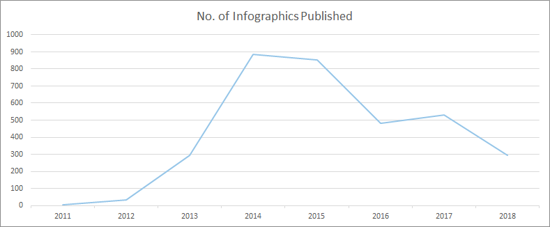
As we’ve not yet finished 2018 (3 months to go at the time this data was pulled), we can estimate the final usage will be in the 380 region, putting it not far from the totals of 2017 and 2016. Impressive stuff in comparison to years gone by.

However, there's a key unknown here. Is the post-2014/15 drop-off due to lack of outreach? Is it a case of content creators simply deciding infographics were no longer the preferred format to cover topics and build links for clients, as they were a few years ago?

Both my past experiences agency-side and my gut feeling would be that content creators are moving away from it as a core format for link building. Not only would this directly impact the frequency they are published, but it would also impact the investment creators place in producing infographics, and in an environment where infographics need to improve to survive, that would only lead to less features.

Another important data point I wanted to look at was the amount of content being published overall. Without this info, there would be no way of knowing if, with content quality improving all the time, journalists were spending a significantly more time on posts than they had previously while publishing at diminishing rates. To this end, I looked at how much content Entrepreneur.com published each year over the same timeframe:

Although the data shows some differences, the graphs are pretty similar. However, it gets really interesting when we divide the number of infographics by the number of articles in total to find out how many infographics exist per article:

There we have it. The golden years of infographics were certainly 2013 and 2014, but they've been riding a wave of consistency since 2015, comprising a higher percentage of overall articles that link builders would have only dreamed of in 2012, when they were way more in fashion.

In fact, by breaking down the number of infographics vs overall content published, there’s a 105% increase in the number of articles that have featured an infographic in 2018 compared to 2012.

Infographics compared to other creative formats

With all this in mind, I still wanted to uncover the fascination with moving away from infographics as a medium of creative storytelling and link building. Is it an obsession with building and using new formats because we’re bored, or is it because other formats provide a better link building ROI?

The next question I wanted to answer was: “How are other content types performing and how do they compare?” Here’s the answer:

Again, using figures publisher-side, we can see that the number of posts that feature infographics is consistently higher than the number of features for interactives and photographic content. Surveys have more recently taken the mantle, but all content types have taken a dip since 2015. However, there’s no clear signal there that we should be moving away from infographics just yet.

In fact, when pitting infographics against all of the other content types (comparing the total number of features), apart from 2013 and 2014 when infographics wiped the floor with everything, there’s no signal to suggest that we need to ditch them:

Year

Infographics vs Interactives

Infographics vs Photography

Infographics vs Surveys

2011

-75%

-67%

-90%

2012

-14%

-14%

-65%

2013

251%

376%

51%

2014

367%

377%

47%

2015

256%

196%

1%

2016

186%

133%

-40%

2017

195%

226%

-31%

2018

180%

160%

-42%

This is pretty surprising stuff in an age where we’re obsessed with interactives and "hero" pieces for link building campaigns.

Surveys are perhaps the surprise package here, having seen the same rise that infographics had through 2012 and 2013, now out-performing all other content types consistently over the last two years.

When I cross-reference to find the number of surveys being used per article, we can see that in every year since 2013 their usage has been increasingly steadily. In 2018, they're being used more often per article than infographics were, even in their prime:

Surveys are one of the "smaller" creative campaigns I’ve offered in my career. It's a format I’m gravitating more towards because of their speed and potential for headlines. Critically, they're also cheaper to produce, both in terms of research and production, allowing me to not only create more of them per campaign, but also target news-jacking topics and build links more quickly compared to other production-heavy pieces.

I think, conclusively, this data shows that for a solid ROI when links are the metric, infographics are still competitive and viable. Surveys will serve you best, but be careful if you’re using the majority of your budget on an interactive or photographic piece. Although the rewards can still be there, it’s a risk.

The link building potential of our link building

For one last dive into the numbers, I wanted to see how different content formats perform for publishers, which could provide powerful insight when deciding which type of content to produce. Although we have no way of knowing when we do our outreach which KPIs different journalists are working towards, if we know the formats that perform best for them (even if they don’t know it), we can help their content perform by proxy — which also serves the performance of our content by funneling increased equity.

Unfortunately, I wasn’t able to extract a comment count or number of social shares per post, which I thought would be an interesting insight to review engagement, so I focused on linking root domains to discover if there is any difference in a publisher's ability to build links based on the formats they cover, and if that could lead to an increase in link equity coming our way.

Here’s the average number of links from different domains for each post featuring a different content type received:

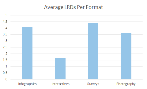
Impressively, infographics and surveys continue to hold up really well. Not only are they the content types that the publisher features more often, they are also the content types that build them the most links.

Using these formats to pitch with not only increases the chances that a publisher's post will rank more competitively in your content's topic area (and put your brand at the center of the conversation), it’s also important for your link building activity because it highlights the potential link equity flowing to your features and, therefore, how much ends up on your domain.

This gives you the potential to rank (directly and indirectly) for a variety of phrases centered around your topic. It also gives your domain/target page and topically associated pages a better chance of ranking themselves — at least where links play their part in the algorithm.

Ultimately, and to echo what I mentioned in my intro-summary, surveys have become the best format for building links. I’d love to know how many are pitched, but the fact they generate the most links for our linkers is huge, and if you are doing content-based link building with SEO-centric KPIs, they give you the best shot at maximizing equity and therefore ranking potential.

Infographics certainly still seem to have a huge part in the conversation. Only move away from them if there’s proof in your data. Otherwise, you could be missing out for no reason.

That’s me, guys. I really hope this data and process is interesting for everyone, and I’d love to hear if you’ve found or had experiences that lead to different conclusions.


Sign up for The Moz Top 10, a semimonthly mailer updating you on the top ten hottest pieces of SEO news, tips, and rad links uncovered by the Moz team. Think of it as your exclusive digest of stuff you don't have time to hunt down but want to read!