Friday, February 28, 2020

Gernot Wagner Misleads on Social Cost of Carbon

A recent Bloomberg article by climate economist Gernot Wagner carries the provocative title: “Why Oil Giants Figured Out Carbon Costs First.” Wagner claims that back in the early 1990s, Exxon had internal estimates of the proper “price” to put on carbon that were much better than those of leading academics. Yet Wagner’s article showcases how utterly misleading the pro-carbon tax crowd can be when “educating” the public.

The 1991 Exxon calculation wasn’t at all what Wagner claims, and so the entire premise of his article collapses. What’s worse, when Wagner discusses the current state of the knowledge, he passingly refers to the actual consensus estimates, but then somehow manages to convey the impression that everybody in the field knows the true number is ten times higher. The whole article is yet another example of my long-standing claim that calculating “the social cost of carbon” is a farce: The peer-reviewed literature generates estimates, and then proponents of aggressive intervention throw these figures out the window and list all the reasons that the “real” number is much higher.

Did Exxon “Know the Truth” Back in 1991?

Wagner first defines the concept of the social cost of carbon (SCC): it is the (present-discounted) dollar value of the future flow of net external damages to humanity from the emission of an additional unit of carbon dioxide. Because these are external damages—meaning they accrue to third parties who aren’t deciding to emit the CO2—the normal market price system allegedly fails to incorporate their harm, leading people to emit too much. This is the textbook argument for a carbon tax or other government interventions in the energy and transportation sectors.

Wagner admits that William Nordhaus—who won the Nobel Prize for his pioneering efforts back in 2018—started the enterprise of estimating the SCC in 1992 with a very low estimate of about $2.50 per ton (in today’s dollars). But because of changes in his model and the inputs given by climate scientists, Nordhaus has refined his estimates over the years and more recently calculated the SCC to be closer to $40 per ton. As Wagner also explains, this type of analysis is what guided the Obama Administration in its own interagency working group’s estimates for the SCC.

The Climate Leadership Council (CLC) also picked $40/ton as the starting point for its signature carbon tax. Exxon publicly endorses the CLC plan. Now here’s where things get interesting, as Wagner informs us:

Has Exxon seen the light? Is $40 the magic number?…

Not so fast.

For one thing, Exxon itself knew better a year before Nordhaus first published DICE. In April 1991, Imperial Oil, based in Calgary, Alberta, and controlled by ExxonMobil, issued an internal “Discussion Paper on Global Warming Response Option” with a preface signed by its then-chairman and -chief executive officer, estimating the need for a price of around $75 per ton of CO₂ (in today’s U.S. dollars) to stabilize Canada’s carbon emissions. That is 30 times more than what Nordhaus proposed as the “optimal” price a year later.

To be clear, the Exxon report was a very different document from Nordhaus’s DICE model. For one thing, it didn’t calculate the SCC. Exxon’s $75 was simply the number calculated to stabilize Canada’s CO₂ emissions. That’s far from a trajectory that balances global benefits of emissions reductions with its costs. [Bold added.]

Although he introduces it with the phrase “To be clear,” the part I’ve put in bold in the quotation above actually destroys the entire premise of Wagner’s article. The people working (indirectly) for Exxon had apparently performed a calculation to determine that a $75/ton tax on carbon dioxide would be necessary in order to stabilize Canadian emissions. But whoever said that this calculation was the same thing as calculating the socially optimal “price” on carbon? As Wagner admits, that’s not the exercise they were performing.

Look, by the same token, bean counters at Disney World could estimate the price they would need to charge for admission in order to stabilize the number of annual visitors to the Magic Kingdom. But such a calculation wouldn’t make it the right price.

Wagner is simply taking it for granted that the correct thing for humanity to do back in the early 1990s would be to stabilize Canadian (and presumably, global) emissions much more rapidly than in fact happened. Yet that’s the very issue under dispute. Nordhaus’ model—which to repeat, was one (of three) selected by the Obama Administration when trying to quantify the harms of climate change—actually says that the “economically optimal” carbon tax would allow for a cumulative 3.5 degrees (!) Celsius of warming by the year 2100.

For all we know, if someone had informed him back in 1992 of the Exxon calculation, Nordhaus would have responded, “Yes, I agree that a tax on carbon around $75/ton would be necessary to stabilize Canadian emissions, but so what? That would be far too aggressive a brake.” So it’s not at all clear that the Exxon people running those calculations in 1991 were looking at things differently from the expert of the day (i.e. Nordhaus).

The Literature Supports Nordhaus, Not Wagner

Now it’s true, Wagner argues that Nordhaus’ estimates are woefully inadequate. He is free to do so, of course, and maybe he’s right. But Nordhaus just won a Nobel for his work, whereas Wagner is a Clinical Associate Professor at NYU. (To be sure, Wagner has a much more prestigious academic post at the moment than I do—I’m just explaining the “on paper” credentials of Nordhaus versus his critic.) And this brings us to the second piece of misdirection in Wagner’s article, where he somehow tries to convince the reader that Nordhaus’ Nobel-winning work is now understood by all the experts to be wrong:

The economics profession has made important headway on how to calculate climate damages, but there’s still a long way to go.

Almost every time someone tinkers with [Nordhaus’] DICE [model] to change one or two key inputs, SCC figures go up. If you include the fact that climate damages hit growth rates, not levels of gross domestic product, prices increase from $40 to $200 or more. If you look to a different model and assess country-level damages, the average might surpass $400 per ton. Now go to a different model altogether and look to financial economics for insights on how to deal with climate risk; my co-authors, Kent Daniel and Bob Litterman, and I were unable to get the price below $100. [Bold added.]

The parts I’ve put in bold are why I’m claiming that Wagner is trying to convince his readers that we shouldn’t really trust Nordhaus’ estimate. Gosh, once you start really thinking about the complexities of climate change—not like that slouch Nordhaus—you end up with SCC estimates that are double or even ten times his own estimates. Try to keep up, old man!

And yet, the other peer-reviewed estimates of the SCC are in line with Nordhaus’ approach. For example, Richard Tol—who developed another of the three models used by the Obama Administration in its own calculations—has been periodically updating his reports on all of the published estimates; here is his 2018 journal article. If you select a 3 percent “pure rate of time preference” (more on this choice below), then Tol (2018) reports that the literature indicates a mode SCC estimate of $28/ton and a mean SCC estimate of $44/ton.

And even more recent than his 2018 article, on February 15 of this year Tol tweeted out the fact that “[t]he number of estimates of the social cost of carbon has tripled since 2013” but yet “[t]he average estimate has not changed.”[1]

Lots of Moving Parts When Reporting “the” Social Cost of Carbon

I should caution the reader that it’s very difficult to consult the published economics literature and come up with “the” estimate of the social cost of carbon (for a given year), because there are several moving parts. Even if two economists stipulate the same basic climate model, their differences on the appropriate tradeoff between present and future damages (for example) might lead to an enormous difference in the implied estimates of the SCC.

To give a flavor of how complicated this gets, consider the following table that I’ve reproduced from Nordhaus’ own 2017 article on the social cost of carbon, published in the (prestigious) Proceedings of the National Academies of Science (PNAS):

Source: Proceedings of the National Academies of Science

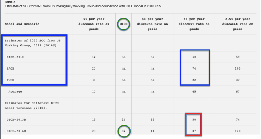
As the table shows (click to enlarge), as of the latest calibration of his model in 2016, Nordhaus thought the best estimate of the SCC for the year 2020, measured in 2010 dollars, was $37/ton of carbon dioxide. (I circled it in green.) This was actually $3 per ton less than what the Obama Administration Interagency Working Group had estimated for the SCC back in 2013, using the 2010 version of the DICE model. (In the table, I put blue rectangles around all of the Obama Working Group’s estimates—relying on DICE and two other models.)

So does that mean Nordhaus thought the threat of climate change had fallen from 2010 to 2016? No. As I show with the red rectangle, by 2013 Nordhaus’ model would have increased the $40 estimate to $50, and by 2016 it increased to $87—more than doubling in six years!

What the heck is going on here? The answer is that back in 2013, when the Obama Working Group used the 2010 version of DICE (as well as the then-up-to-date versions of the PAGE and FUND models), they plugged in a constant rate of discount on future goods. The generally accepted middle-of-the-road figure was 3%, and that’s why everybody said, “Nordhaus’ model says the SCC is $40/ton.”

Yet Nordhaus himself doesn’t think this is the economically correct way to proceed, and prefers to use market-derived tradeoffs between present and future goods. (Note that the discount rate on goods isn’t the same thing as the “pure rate of time preference” mentioned in Tol’s paper; click through and read Nordhaus’ PNAS article for a good but technical explanation.) In other words, back when the Obama Administration used Nordhaus’ model to estimate the SCC, they plugged in some assumptions that at the time vastly overstated the SCC, relative to how the model’s developer himself thought proper.

Besides showing just how complicated this all gets, and why the innocent outsider will have a tough time “checking the literature to see what the consensus SCC estimate is,” there are two takeaways from the table above:

  • It wasn’t just Nordhaus’ DICE mode, but two others that were selected by the Obama Administration to calculate the SCC. For the 3% discount rate, Richard Tol’s FUND model spat out a $22/ton estimate, while Chris Hope’s PAGE model gave a bigger estimate of $74/ton. There was no cherry-picking in the selection of these models; in my years of reading this literature, I have not seen a single complaint that some other model was more representative of the state of the art than these three. So when Wagner writes “my co-authors, Kent Daniel and Bob Litterman, and I were unable to get the price below $100,” keep in mind that they were tying their hands in a very specific way. The scientists and wonks in the Obama EPA had no problem using the top-3 models from the literature to generate SCC estimates well below $100.
  • Nordhaus has continually updated his model in light of developments in both economic theory and to make the underlying climate model fit the physical science literature better. It’s not at all the case that “climate economics” has moved on, leaving the veteran in the dust. Nordhaus himself has written responses to challenges coming from (among others) Wagner’s own mentor and hero, the recently (and tragically) deceased Martin Weitzman. Maybe Nordhaus is right or maybe he’s wrong, but this isn’t a case of Isaac Newton versus Albert Einstein, as Wagner’s article would lead the innocent reader to believe.

Wagner Only Considers Factors That Increase the SCC

The fundamental problem with Wagner’s glib discussion is that he brainstorms and throws out some considerations that all push the SCC up. But there are other considerations that push the baseline theoretical estimates of the SCC down.

For example: Although they don’t often spell it out (Nordhaus himself is a happy exception, for he does talk about it at length in his book A Question of Balance), when economists estimate the “optimal” carbon tax they are assuming it is implemented worldwide and stays in force for decades to come. For if China and India (say) don’t implement a carbon tax while only Europe, Canada, and the US do, then the “optimal” carbon tax in those regions ends up being lower because of “leakage,” where some emissions migrate from the taxed to the untaxed jurisdiction. The actual experience with carbon taxes around the world shows that they are often scaled back or eliminated entirely when the public grows tired of high energy prices.

Another huge problem is that the optimal carbon tax should take account of the pre-existing tax code. Contrary to intuitive (yet wrong) claims, the baseline result in the peer-reviewed literature on the so-called “tax interaction effect” is that distortionary income and capital taxes actually reduce the case for imposing even a revenue-neutral carbon tax. At an IER panel that I helped organize, economist Ross McKitrick—who is the author of a graduate-level text on environmental economics—made a plausible case that when you consider the tax interaction effect and some other factors, the “optimal” carbon tax is close to zero.

Finally, we can use good old-fashioned political economy: Regardless of the theoretically “optimal” carbon tax, what are the odds that we can trust the political process to actually implement it and keep it at that level over the coming decades, especially as the budget hole from entitlement programs and net interest gets deeper and deeper? The advocates of a carbon tax never even mention this, let alone do they plausibly account for it in their “modeling.” (All of these objections are discussed in my Cato article co-authored with climate scientists Pat Michaels and Paul Knappenberger and my own IER study.)

Conclusion

The global climate and the global economy are both incredibly complex systems, and it is ludicrous that so many academics are trying to anchor tax policy in projections of how carbon emissions today will affect the temperature in the year 2100. So if Gernot Wagner and others want to point out all of the shortcomings in the exiting literature, fair enough.

Yet Wagner wraps up his Bloomberg article by saying: “By now, climate economics…knows $40 to be woefully inadequate… A baby step is for economists to stop talking about $40 as if it were a sensible starting point. It is not. Try $100 or more instead.” The average reader would think that “the experts” all agreed with Wagner, and yet as I’ve shown above, this isn’t the case at all.

Some experts—such as Wagner’s (late) co-author Martin Weitzman—think the consensus in the literature is wrong, but Weitzman and Wagner don’t speak on behalf of “climate economics.” Wagner and Weitzman are actually deviating from the consensus. It is amazing that the same camp beating right-wingers over the head for “denying the consensus” on climate science then throw out (much of) the peer-reviewed literature when it comes to the economics of climate change.

______________________

[1] A note for purists: Tol’s accompanying chart in his tweet at first glance looks like it supports Wagner’s case (because the relatively constant median estimate of the SCC is high), but the problem is that Tol doesn’t specify his units or the assumptions behind the chart. (I asked him to clarify but as of this writing he hadn’t answered me.) In any event, see my discussion of Nordhaus’ table in the text above to understand why these considerations are so important.

The post Gernot Wagner Misleads on Social Cost of Carbon appeared first on IER.

The Rules of Link Building - Best of Whiteboard Friday

Posted by BritneyMuller

Are you building links the right way? Or are you still subscribing to outdated practices? Britney Muller clarifies which link building tactics still matter and which are a waste of time (or downright harmful) in one of our very favorite classic episodes of Whiteboard Friday.

The Rules of Link Building

Click on the whiteboard image above to open a high-resolution version in a new tab!

Video Transcription

Happy Friday, Moz fans! Welcome to another edition of Whiteboard Friday. Today we are going over the rules of link building. It's no secret that links are one of the top three ranking factors in Google and can greatly benefit your website. But there is a little confusion around what's okay to do as far as links and what's not. So hopefully, this helps clear some of that up.

The Dos

All right. So what are the dos? What do you want to be doing? First and most importantly is just to...

I. Determine the value of that link. So aside from ranking potential, what kind of value will that link bring to your site? Is it potential traffic? Is it relevancy? Is it authority? Just start to weigh out your options and determine what's really of value for your site. Our own tool, Moz Link Explorer, can 

II. Local listings still do very well. These local business citations are on a bunch of different platforms, and services like Moz Local or Yext can get you up and running a little bit quicker. They tend to show Google that this business is indeed located where it says it is. It has consistent business information — the name, address, phone number, you name it. But something that isn't really talked about all that often is that some of these local listings never get indexed by Google. If you think about it, Yellowpages.com is probably populating thousands of new listings a day. Why would Google want to index all of those?

So if you're doing business listings, an age-old thing that local SEOs have been doing for a while is create a page on your site that says where you can find us online. Link to those local listings to help Google get that indexed, and it sort of has this boomerang-like effect on your site. So hope that helps. If that's confusing, I can clarify down below. Just wanted to include it because I think it's important.

III. Unlinked brand mentions. One of the easiest ways you can get a link is by figuring out who is mentioning your brand or your company and not linking to it. Let's say this article publishes about how awesome SEO companies are and they mention Moz, and they don't link to us. That's an easy way to reach out and say, "Hey, would you mind adding a link? It would be really helpful."

IV. Reclaiming broken links is also a really great way to kind of get back some of your links in a short amount of time and little to no effort. What does this mean? This means that you had a link from a site that now your page currently 404s. So they were sending people to your site for a specific page that you've since deleted or updated somewhere else. Whatever that might be, you want to make sure that you 301 this broken link on your site so that it pushes the authority elsewhere. Definitely a great thing to do anyway.

V. HARO (Help a Reporter Out). Reporters will notify you of any questions or information they're seeking for an article via this email service. So not only is it just good general PR, but it's a great opportunity for you to get a link. I like to think of link building as really good PR anyway. It's like digital PR. So this just takes it to the next level.

VI. Just be awesome. Be cool. Sponsor awesome things. I guarantee any one of you watching likely has incredible local charities or amazing nonprofits in your space that could use the sponsorship, however big or small that might be. But that also gives you an opportunity to get a link. So something to definitely consider.

VII. Ask/Outreach. There's nothing wrong with asking. There's nothing wrong with outreach, especially when done well. I know that link building outreach in general kind of gets a bad rap because the response rate is so painfully low. I think, on average, it's around 4% to 7%, which is painful. But you can get that higher if you're a little bit more strategic about it or if you outreach to people you already currently know. There's a ton of resources available to help you do this better, so definitely check those out. We can link to some of those below.

VIII. COBC (create original badass content). We hear lots of people talk about this. When it comes to link building, it's like, "Link building is dead. Just create great content and people will naturally link to you. It's brilliant." It is brilliant, but I also think that there is something to be said about having a healthy mix. There's this idea of link building and then link earning. But there's a really perfect sweet spot in the middle where you really do get the most bang for your buck.

The Don'ts

All right. So what not to do. The don'ts of today's link building world are...

I. Don't ask for specific anchor text. All of these things appear so spammy. The late Eric Ward talked about this and was a big advocate for never asking for anchor text. He said websites should be linked to however they see fit. That's going to look more natural. Google is going to consider it to be more organic, and it will help your site in the long run. So that's more of a suggestion. These other ones are definitely big no-no's.

II. Don't buy or sell links that pass PageRank. You can buy or sell links that have a no-follow attached, which attributes that this is paid-for, whether it be an advertisement or you don't trust it. So definitely looking into those and understanding how that works.

III. Hidden links. We used to do this back in the day, the ridiculous white link on a white background. They were totally hidden, but crawlers would pick them up. Don't do that. That's so old and will not work anymore. Google is getting so much smarter at understanding these things.

IV. Low-quality directory links. Same with low-quality directory links. We remember those where it was just loads and loads of links and text and a random auto insurance link in there. You want to steer clear of those.

V. Site-wide links also look very spammy. Site-wide being whether it's a footer link or a top-level navigation link, you definitely don't want to go after those. They can appear really, really spammy. Avoid those.

VI. Comment links with over-optimized anchor link text, specifically, you want to avoid. Again, it's just like any of these others. It looks spammy. It's not going to help you long-term. Again, what's the value of that overall? So avoid that.

VII. Abusing guest posts. You definitely don't want to do this. You don't want to guest post purely just for a link. However, I am still a huge advocate, as I know many others out there are, of guest posting and providing value. Whether there be a link or not, I think there is still a ton of value in guest posting. So don't get rid of that altogether, but definitely don't target it for potential link building opportunities.

VIII. Automated tools used to create links on all sorts of websites. ScrapeBox is an infamous one that would create the comment links on all sorts of blogs. You don't want to do that.

IX. Link schemes, private link networks, and private blog networks. This is where you really get into trouble as well. Google will penalize or de-index you altogether. It looks so, so spammy, and you want to avoid this.

X. Link exchange. This is in the same vein as the link exchanges, where back in the day you used to submit a website to a link exchange and they wouldn't grant you that link until you also linked to them. Super silly. This stuff does not work anymore, but there are tons of opportunities and quick wins for you to gain links naturally and more authoritatively.

So hopefully, this helps clear up some of the confusion. One question I would love to ask all of you is: To disavow or to not disavow? I have heard back-and-forth conversations on either side on this. Does the disavow file still work? Does it not? What are your thoughts? Please let me know down below in the comments.

Thank you so much for tuning in to this edition of Whiteboard Friday. I will see you all soon. Thanks.

Video transcription by Speechpad.com


Sign up for The Moz Top 10, a semimonthly mailer updating you on the top ten hottest pieces of SEO news, tips, and rad links uncovered by the Moz team. Think of it as your exclusive digest of stuff you don't have time to hunt down but want to read!

Thursday, February 27, 2020

Coronavirus Lowers Energy Demand and Energy Prices Fall

China’s energy demand is slumping due to the outbreak of the coronavirus (COVID-19) and it is affecting energy markets worldwide. Since energy consumption tends to track with economic performance, the Chinese economy is suffering as well. The Chinese are importing and consuming less oil and natural gas, flying fewer planes, and running fewer factories. China’s oil demand is estimated to have fallen by about a third. It is expected that global oil demand will drop by 4 percent this month. According to the International Energy Agency, year over year demand is expected to fall by 435,000 barrels per day during the first quarter of 2020—the first quarterly contraction in over 10 years. The agency cut its 2020 oil growth forecast by 365,000 barrels per day down to an increase of 825,000 barrel per day. The Energy Information Administration expects global liquid fuels demand will average 101.7 million barrels per day in 2020—1 million barrels per day more than in 2019, but 378,000 barrels per day less than its previous forecast.

China’s demand for liquefied natural gas is also down. China’s largest importer of liquefied natural gas, China National Offshore Oil Corp., which operates nearly half of the country’s terminals, suspended contracts with at least three suppliers because of the coronavirus. The company is declaring “force majeure”—a legal move to suspend contractual obligations in the event of unexpected natural disasters, terrorist attacks, or other “acts of God.”

As the world’s second-largest economy, Chinese demand helps determine international oil and natural gas prices. The price of West Texas intermediate crude oil is around $50 a barrel—a decline of about 20 percent over the last month. The average price of a regular gallon of gasoline recently dropped below $2.40—its lowest level in a year. With the average U.S. household consuming 100 gallons of gasoline a month, a 45-cent decline over the past nine months results in annual savings of $540, or $45 per month back in families’ pockets.

Source: Wall Street Journal

Analysts are projecting plentiful supplies of both oil and natural gas. Futures prices for natural gas are down about 30 percent in the past year, which benefits the U.S. households—about half of the total U.S. households that use natural gas as a primary heating source—as well as businesses which rely upon natural gas for heating and processing.  Asian spot prices for liquefied natural gas have already dropped to $3 per million British thermal units—less than half of what they were at the same time last year. At least one cargo bound for India has traded below the $3 mark—down 30 cents within a week.

Source: Reuters

Electricity

One forecaster expects China’s industrial electricity demand to decline this year by as much as 73 billion kilowatt hours due to the lull in factory output that has occurred because of the virus. While that decline may seem small, representing about 1.5 percent of industrial power consumption in China, the loss is equal to the power used in the country of Chile and it illustrates the scope of the disruption caused by the outbreak. Last year, China’s industrial consumers used 4.85 trillion kilowatt hours of electricity, accounting for 67 percent of the country’s total electricity consumption. If the epidemic goes on past March, China’s power consumption this year is expected to increase by only 3.1 percent—lower than the 4.1 percent initially expected.

The expected reduction in China’s power demand is the energy equivalent of about 30 million metric tons of thermal coal or about 9 million metric tons of liquefied natural gas. The coal figure is more than China’s average monthly imports last year while the LNG figure is a little more than one month of imports, based on customs data.

Electricity demand and industrial output in China remain far below their usual levels, as indicated by:

  • Coal-fired power stations report daily data usage at a four-year low.
  • Oil refinery operating rates in Shandong province are at the lowest level since 2015.
  • Output of key steel product lines are at the lowest level for five years.
  • Domestic flights are down up to 70 percent compared to last month.
  • China car sales dropped 92 percent during the first two weeks of February.


Source: Carbon Brief

The measures to contain the coronavirus have resulted in reductions of 15 percent to 40 percent in output across key industrial sectors, which may have cut a quarter or more of the country’s carbon dioxide emissions over the two-week period when activity would normally have resumed after the Chinese new-year holiday. Over the same period in 2019, China released around 400 million metric tons of carbon dioxide, so the downturn in industrial output could have cut carbon dioxide emissions by 100 million metric tons.

Conclusion

The coronavirus has resulted in the loss of industrial output in China. As economies have become more linked in the recent past, some supply chains have also included partial processing of goods and their transport to other parts of the world, so a reduction in transport or manufacturing affects not just the Chinese, but the rest of the world as well. The loss of industrial output has also resulted in lowered energy demand. The lower demand for oil and natural gas has brought international prices for the fuels down, aiding consumers in the short term but hurting producers and projections for the year. Electricity demand in China has also been reduced due to lower industrial output. The lower demand and lower prices are not expected to continue once the virus is totally contained. But, the date when that will occur is unclear, particularly since other countries (South Korea, Iran, and Italy) have now seen large increases in the number of affected cases.

There is no doubt that we are seeing significant impacts upon the energy economy throughout the world as a result of the coronavirus. Energy use is typically one of the fastest indicators of economic performance owing to its vast importance in every aspect of economic growth. The coronavirus is simply a reminder of just how intertwined energy and economic progress have become.

The post Coronavirus Lowers Energy Demand and Energy Prices Fall appeared first on IER.

Wednesday, February 26, 2020

How Low Can #1 Go? (2020 Edition)

Posted by Dr-Pete

Being #1 on Google isn't what it used to be. Back in 2013, we analyzed 10,000 searches and found out that the average #1 ranking began at 375 pixels (px) down the page. The worst case scenario, a search for "Disney stock," pushed #1 all the way down to 976px.

A lot has changed in seven years, including an explosion of rich SERP (Search Engine Results Page) features, like Featured Snippets, local packs, and video carousels. It feels like the plight of #1 is only getting worse. So, we decided to run the numbers again (over the same searches) and see if the data matches our perceptions. Is the #1 listing on Google being pushed even farther down the page?

I try to let the numbers speak for themselves, but before we dig into a lot of stats, here's one that legitimately shocked me. In 2020, over 1,600 (16.6%) of the searches we analyzed had #1 positions that were worse than the worst-case scenario in 2013. Let's dig into a few of these ...

What's the worst-case for #1?

Data is great, but sometimes it takes the visuals to really understand what's going on. Here's our big "winner" for 2020, a search for "lollipop" — the #1 ranking came in at an incredible 2,938px down. I've annotated the #1 position, along with the 1,000px and 2,000px marks ...

At 2,938px, the 2020 winner comes in at just over three times 2013's worst-case scenario. You may have noticed that the line is slightly above the organic link. For the sake of consistency and to be able to replicate the data later, we chose to use the HTML/CSS container position. This hits about halfway between the organic link and the URL breadcrumbs (which recently moved above the link). This is a slightly more conservative measure than our 2013 study.

You may also have noticed that this result contains a large-format video result, which really dominates page-one real estate. In fact, five of our top 10 lowest #1 results in 2020 contained large-format videos. Here's the top contender without a large-format video, coming in at fourth place overall (a search for "vacuum cleaners") ...

Before the traditional #1 organic position, we have shopping results, a research carousel, a local pack, People Also Ask results, and a top products carousel with a massive vertical footprint. This is a relentlessly commercial result. While only a portion of it is direct advertising, most of the focus of the page above the organic results is on people looking to buy a vacuum.

What about the big picture?

It's easy — and more than a little entertaining — to cherry-pick the worst-case scenarios, so let's look at the data across all 10,000 results. In 2013, we only looked at the #1 position, but we've expanded our analysis in 2020 to consider all page-one organic positions. Here's the breakdown ...

The only direct comparison to 2013 is the position #1 row, and you can see that every metric increased, some substantially. If you look at the maximum Y-position by rank, you'll notice that it peaks around #7 and then begins to decrease. This is easier to illustrate in a chart ...

To understand this phenomenon, you have to realize that certain SERP features, like Top Stories and video carousels, take the place of a page-one organic result. At the same time, those features tend to be longer (vertically) than a typical organic result. So, a page with 10 traditional organic results will in many cases be shorter than a page with multiple rich SERP features.

What's the worst-case overall?

Let's dig into that seven-result page-one bucket and look at the worst-case organic position across all of the SERPs in the study, a #7 organic ranking coming in at 4,487px ...

Congratulations, you're finally done scrolling. This SERP has seven traditional organic positions (including one with FAQ links), plus an incredible seven rich features and a full seven ads (three are below the final result). Note that this page shows the older ad and organic design, which Google is still testing, so the position is measured as just above the link.

How much do ads matter?

Since our 2013 study (in early 2016), Google removed right-hand column ads on desktop and increased the maximum number of top-left ads from three to four. One notable point about ads is that they have prime placement over both organic results and SERP features. So, how does this impact organic Y-positions? Here's a breakdown ...

Not surprisingly, the mean and median increase as ad-count increases – on average, the more ads there are, the lower the #1 organic position is. So why does the maximum Y-position of #1 decrease with ad-count? This is because SERP features are tied closely to search intent, and results with more ads tend to be more commercial. This naturally rules out other features.

For example, while 1,270 SERPs on February 12 in our 10,000-SERP data set had four ads on top, and 1,584 had featured snippets, only 16 had both (just 1% of SERPs with featured snippets). Featured snippets naturally reflect informational intent (in other words, they provide answers), whereas the presence of four ads signals strong commercial intent.

Here's the worst-case #1 position for a SERP with four ads on top in our data set ...

The college results are a fairly rare feature, and local packs often appear on commercial results (as anyone who wants to buy something is looking for a place to buy it). Even with four ads, though, this result comes in significantly higher than our overall worst-case #1 position. While ads certainly push down organic results, they also tend to preclude other rich SERP features.

What about featured snippets?

In early 2014, a year after our original study, Google launched featured snippets, promoted results that combine organic links with answers extracted from featured pages. For example, Google can tell you that I am both a human who works for Moz and a Dr. Pepper knock-off available at Target ...

While featured snippets are technically considered organic, they can impact click-through rates (CTR) and the extracted text naturally pushes down the organic link. On the other hand, Featured Snippets tend to appear above other rich SERP features (except for ads, of course). So, what's the worst-case scenario for a #1 result inside a featured snippet in our data set?

Ads are still pushing this result down, and the bullet list extracted from the page takes up a fair amount of space, but the absence of other SERP features above the featured snippet puts this in a much better position than our overall worst-case scenario. This is an interesting example, as the "According to mashable.com ..." text is linked to Mashable (but not considered the #1 result), but the images are all linked to more Google searches.

Overall in our study, the average Y-position of #1 results with featured snippets was 99px lower/worse (704px) than traditional #1 results (605px), suggesting a net disadvantage in most cases. In some cases, multiple SERP features can appear between the featured snippet and the #2 organic result. Here's an example where the #1 and #2 result are 1,342px apart ...

In cases like this, it's a strategic advantage to work for the featured snippet, as there's likely a substantial drop-off in clicks from #1 to #2. Featured snippets are going to continue to evolve, and examples like this show how critical it is to understand the entire landscape of your search results.

When is #2 not worth it?

Another interesting case that's evolved quite a bit since 2013 is brand searches, or as Google is more likely to call them, "dominant intent" searches. Here's a SERP for the company Mattress Firm ...

While the #1 result has solid placement, the #2 result is pushed all the way down to 2,848px. Note that the #1 position has a search box plus six full site-links below it, taking up a massive amount of real estate. Even the brand's ad has site-links. Below #1 is a local pack, People Also Ask results, Twitter results from the brand's account, heavily branded image results, and then a product refinement carousel (which leads to more Google searches).

There are only five total, traditional organic results on this page, and they're made up of the company's website, the company's Facebook page, the company's YouTube channel, a Wikipedia page about the company, and a news article about the company's 2018 bankruptcy filing.

This isn't just about vertical position — unless you're Mattress Firm, trying to compete on this search really doesn't make much sense. They essentially own page one, and this is a situation we're seeing more and more frequently for searches with clear dominant intent (i.e. most searchers are looking for a specific entity).

What's a search marketer to do?

Search is changing, and change can certainly be scary. There's no question that the SERP of 2020 is very different in some ways than the SERP of 2013, and traditional organic results are just one piece of a much larger picture. Realistically, as search marketers, we have to adapt — either that, or find a new career. I hear alpaca farming is nice.

I think there are three critical things to remember. First, the lion's share of search traffic still comes from traditional organic results. Second, many rich features are really the evolution of vertical results, like news, videos, and images, that still have an organic component. In other words, these are results that we can potentially create content for and rank in, even if they're not the ten blue links we traditionally think of as organic search.

Finally, it's important to realize that many SERP features are driven by searcher intent and we need to target intent more strategically. Take the branded example above — it may be depressing that the #2 organic result is pushed down so far, but ask yourself a simple question. What's the value of ranking for "mattress firm" if you're not Mattress Firm? Even if you're a direct competitor, you're flying in the face of searchers with a very clear brand intent. Your effort is better spent on product searches, consumer questions, and other searches likely to support your own brand and sales.

If you're the 11th person in line at the grocery checkout and the line next to you has no people, do you stand around complaining about how person #2, #7, and #9 aren't as deserving of groceries as you are? No, you change lines. If you're being pushed too far down the results, maybe it's time to seek out different results where your goals and searcher goals are better aligned.

Brief notes on methodology

Not to get too deep in the weeds, but a couple of notes on our methodology. These results were based on a fixed set of 10,000 keywords that we track daily as part of the MozCast research project. All of the data in this study is based on page-one, Google.com, US, desktop results. While the keywords in this data set are distributed across a wide range of topics and industries, the set skews toward more competitive "head" terms. All of the data and images in this post were captured on February 12, 2020. Ironically, this blog post is over 26,000 pixels long. If you're still reading, thank you, and may God have mercy on your soul.


Sign up for The Moz Top 10, a semimonthly mailer updating you on the top ten hottest pieces of SEO news, tips, and rad links uncovered by the Moz team. Think of it as your exclusive digest of stuff you don't have time to hunt down but want to read!

Tuesday, February 25, 2020

Northeastern States Face New Transportation Tax-and-Spend Frenzy

Twelve states and the District of Columbia are considering joining together in the Transportation and Climate Initiative to reduce greenhouse gas emissions from gasoline and on-road diesel fuel use.  They call the tool they propose using “Cap and Invest,” which is putting lipstick on the old cap-and-trade scheme, which itself was just another tax-and-spend proposal.

The initiative, which would encompass the region from Virginia north through the Mid-Atlantic and into New England, is a convoluted money grab based on a weak justification.

The first problem is misleading findings used to justify the program. Page 1 of the draft Memorandum of Understanding starts with:

“WHEREAS, climate change has resulted in the increased frequency and severity of extreme weather events that have adversely impacted every Signatory Jurisdiction; and

“WHEREAS, climate change poses a clear, present, and increasingly dangerous threat to the communities and economic security of each Signatory Jurisdiction; and…”

Of late, it seems every hurricane, flood, drought and tornado is offered as evidence of a climate crisis, here and now.  However, that’s not what the data show.

There has been no significant upward trend in hurricanes, floods, or droughts according to the Intergovernmental Panel on Climate Change’s Fifth Assessment Report’s chapter on extreme weather.

On page 217 of the report the authors write, “In summary, this assessment does not revise the SREX conclusion of low confidence that any reported long-term (centennial) increases in tropical cyclone activity are robust, after accounting for past changes in observing capabilities. More recent assessments indicate that it is unlikely that annual numbers of tropical storms, hurricanes and major hurricanes counts have increased over the past 100 years in the North Atlantic basin.”  Though they then point to an increase in hurricanes since the 1970s, a chart on the previous page shows the 1970s were a nadir of hurricane activity.

The conclusion regarding floods is found on page 214.  It reads, “In summary, there continues to be a lack of evidence and thus low confidence regarding the sign of trend in the magnitude and/or frequency of floods on a global scale.”

Regarding droughts they say, “In summary, the current assessment concludes that there is not enough evidence at present to suggest more than low confidence in a global-scale observed trend in drought or dryness (lack of rainfall) since the middle of the 20th century, owing to lack of direct observations, geographical inconsistencies in the trends, and dependencies of inferred trends on the index choice. Based on updated studies, AR4 conclusions regarding global increasing trends in drought since the 1970s were probably overstated.” (page 215)  They then point out that the frequency and intensity of droughts are likely to have decreased in North America since 1950.

The National Centers for Environmental Information looks at trends for tornadoes.  They conclude, “The bar charts below indicate there has been little trend in the frequency of the stronger tornadoes over the past 55 years.”

Source: National Oceanic and Atmospheric Administration

The cap-and-trade proposal outlined in the draft memorandum doesn’t seem like much of a solution to any problem other than how to scarf up billions of more dollars out of the TCI region’s residents.

Channeling Goldilocks, we can look at the middle of the three proposed caps, as presented in a December 2019 TCI webinar.  Here they propose to reduce the CO2 emissions from transportation fuels by 22 percent between 2022 and 2032.

Give the authors credit for not making it too difficult to see that doing nothing will lead to a cut of nearly the same result.  That is, the business-as-usual baseline already has the CO2 emissions dropping 19 percent—without taxing billions of dollars from transportation users.

The “clear and present danger” is to the wallets of TCI state residents—not only of drivers, but of everyone who benefits from the countless products transported in the region by truck.

And TCI it will be even worse than what the hired wonks have outlined.  Here’s why:

Cap-and-trade schemes create an artificial scarcity of something—in this case transportation fuel.  In order to get the fuel, in addition to the money you will need something called an allowance (in essence a ration coupon).  The way cap and- trade- will be implemented saves the retail consumers the hassle of dealing with the allowances, but it does not free consumers from the added cost of the artificial scarcity.

In order to sell transportation fuel, distributors will need enough allowances to match the quantity of fuel they sell (weighted by the per-unit CO2 emissions for each type of fuel).  Where do the fuel-distributors get the allowances? That’s the billion-dollar question. They can buy them from the initial auction. They can buy them from somebody who bought them at the auction.  Or, they can buy them from somebody who was given some allowances before the auction.

If you wanted to design something to maximize special-interest horse-trading and hogs-at-the-trough shenanigans, you could not do better than a cap-and-trade bill.  In addition to the outsized political wheeling and dealing that any new undesignated revenue stream would generate, cap-and-trade adds a feature unavailable when revenues come from taxes.  That feature is that you can give money away while pretending it is not an expenditure.

The Waxman-Markey cap-and-trade bill passed by the House of Representatives (but not the Senate) in 2009 ballooned to over 1,400 pages before it was done.  As the bill was being debated, staffers were seen walking up to the table on which the bill sat and swapping out pages to match the political deals that were being made even up to the last minute.  Many of those deals involved allocating the allowances to one preferred group or another.

It is not hard to imagine similar sorts of political deals as the TCI goes from draft memorandum to actual implementation. Perhaps it will be something like the following.  A major transportation company will say, “We are one of the biggest operators in the country. Our terminal is in our home state, but we deliver a lot of stuff outside of the TCI region and have to compete with trucking companies whose terminals are in states without the higher fuel cost.  We are willing to do our share, blah, blah, blah…” That seems to make sense, so they are given allowances to cover some portion of their higher fuel cost.

These pleas to get a chunk of the allowances will be limited only by the creativity of the army of lobbyists going after them.  You will need a big bag of popcorn for this show.

What you will not see in this show, is any estimate of how much any future global warming or sea-level rise will be attenuated by the puny (but costly) CO2 cuts.  The projected cuts are no more than hundredths of one percent of world CO2 emissions. Any climate impact will be too little to measure and much too little to notice.

Below is a chart from a TCI presentation last December (2019) showing the CO2 trajectory:

The black reference line shows what is expected to happen without any cap-and-trade.  The others show what happens to CO2 with the costly TCI program in place. If the chart were scaled to show the impact on worldwide emissions, it would not be possible to distinguish between any reference line and a line showing worldwide emissions minus the TCI cuts.

In summary, the Transportation and Climate Initiative will squeeze the transportation industry (and all its beneficiaries) out of billions of dollars per year while providing climate benefits that are too small to measure.  In the bargain it will create a special-interest feeding frenzy and an all-new bureaucracy.

The post Northeastern States Face New Transportation Tax-and-Spend Frenzy appeared first on IER.

Trivia Tuesday Round 4

  • ANYONE CAN WIN: you don't have to be an expert or answer the question right - just participate to be entered to win FREE online training with SEI!

  • HOW TO PLAY: watch the trivia question video above, fill in the fields below, then hit the submit button. After submission, you will receive the correct answer.

Breathe Easier: IER Highlights Real Drivers Behind America’s Improved Air Quality

As the 50th “Earth Day” approaches, Americans should celebrate our environmental successes and pay tribute to the key drivers that lead towards a healthier environment.

WASHINGTON DC (February 25, 2020) –The Institute for Energy Research (IER) has released a short, four-minute video and accompanying report, highlighting the true state of our environment and the significant role that human ingenuity, free markets, and technology play in America’s improved air quality.

According to the EPA, between 1970 and 2017, U.S. gross domestic product increased 262 percent, vehicle miles traveled increased 189 percent, energy consumption increased 59 percent, and U.S. population increased by 44 percent. During the same time period, total emissions of the six principal air pollutants dropped by 73 percent.

Despite increased use of our natural resources in almost every sector, U.S. measurements of air pollutants are lower today than 50 years ago. How this monumental – yet often misunderstood – success took place is at the center of IER’s newest educational initiative.

Please take four minutes of your time to watch this video and breathe a little easier knowing that Americans have done an incredible job at improving and protecting our environment.

IER’s research draws from two models – the Environmental Kuznets Curve and the Environmental Transition Hypothesis. Thomas Pyle, President of IER, issued the following statement following the announced roll out of the Breathe Easier campaign.

“While we must always strive to do better, sometimes a little perspective goes a long way. Economic development and environmental quality are not at odds with each other, and the false choice being presented by the green left is flat out misleading. Instead of celebrating the good news of our improved air quality and living standards, the green lobby and their political allies are bombarding Americans with doomsday scenarios that severely discount the power of human ingenuity in protecting our environment.”

“While some may want to cite environmental regulations and mandates as the only road to America’s improved air quality, it is quite clearly that human ingenuity, free markets, and modern technology is cleaning up our nation.”

“Americans understand that governments don’t solve problems, people do. Some of the proposals coming from Congress or being touted by the Democratic presidential candidates would needlessly wreck our economy and deny opportunities for those on the lower end of the economic ladder with little or no environmental improvement in return. We should let human ingenuity, free markets, and technology continue to drive environmental improvement, not energy bans, taxes, or other political schemes designed to dictate our energy choices from Washington, D.C.”

“On this upcoming Earth Day, we should be celebrating our environmental success, not demonizing American energy workers. The fact is, we can all breathe a little easier knowing that America’s economy and environment are better than ever.”

Dr. Bob Murphy, Senior Economist at the Institute for Energy Research, added the following:

“If a society starts out on the edge of starvation, then its people – even the children – will toil on farms and in factories, and they won’t waste money installing filters on smokestacks. But as they grow richer, they shift away from these methods of production.”

“A rich, modern economy can afford to produce large quantities of food, electronics, energy, and houses without pumping soot into the air, and without requiring adults to work 80-hour weeks or kids to fill the factories. The path to such progress is saving and capital accumulation, so that workers have better tools and equipment and thus a higher productivity per hour of labor. If we take a society on the verge of starvation and simply pass laws prohibiting the business practices certain observers find distasteful, we won’t magically make these people more productive. Instead we will condemn them to death.”

“As people grow richer they can afford the luxury of a cleaner environment.”

_______________________

For media inquiries, please contact Jon Haubert
jon@hblegacy.com
303.396.5996

###

The post Breathe Easier: IER Highlights Real Drivers Behind America’s Improved Air Quality appeared first on IER.

Are H1 Tags Necessary for Ranking? [SEO Experiment]

Posted by Cyrus-Shepard

In earlier days of search marketing, SEOs often heard the same two best practices repeated so many times it became implanted in our brains:

  1. Wrap the title of your page in H1 tags
  2. Use one — and only one — H1 tag per page

These suggestions appeared in audits, SEO tools, and was the source of constant head shaking. Conversations would go like this:

"Silly CNN. The headline on that page is an H2. That's not right!"
"Sure, but is it hurting them?"
"No idea, actually."

Over time, SEOs started to abandon these ideas, and the strict concept of using a single H1 was replaced by "large text near the top of the page."

Google grew better at content analysis and understanding how the pieces of the page fit together. Given how often publishers make mistakes with HTML markup, it makes sense that they would try to figure it out for themselves.

The question comes up so often, Google's John Muller addressed it in a Webmaster Hangout:

"You can use H1 tags as often as you want on a page. There's no limit — neither upper nor lower bound.
H1 elements are a great way to give more structure to a page so that users and search engines can understand which parts of a page are kind of under different headings, so I would use them in the proper way on a page.
And especially with HTML5, having multiple H1 elements on a page is completely normal and kind of expected. So it's not something that you need to worry about. And some SEO tools flag this as an issue and say like 'oh you don't have any H1 tag' or 'you have two H1 tags.' From our point of view, that's not a critical issue. From a usability point of view, maybe it makes sense to improve that. So, it's not that I would completely ignore those suggestions, but I wouldn't see it as a critical issue.
Your site can do perfectly fine with no H1 tags or with five H1 tags."

Despite these assertions from one of Google's most trusted authorities, many SEOs remained skeptical, wanting to "trust but verify" instead.

So of course, we decided to test it... with science!

Craig Bradford of Distilled noticed that the Moz Blog — this very one — used H2s for headlines instead of H1s (a quirk of our CMS).

H2 Header
h1 SEO Test Experiment

We devised a 50/50 split test of our titles using the newly branded SearchPilot (formerly DistilledODN). Half of our blog titles would be changed to H1s, and half kept as H2. We would then measure any difference in organic traffic between the two groups.

After eight weeks, the results were in:

To the uninitiated, these charts can be a little hard to decipher. Rida Abidi of Distilled broke down the data for us like this:

Change breakdown - inconclusive
  • Predicted uplift: 6.2% (est. 6,200 monthly organic sessions)
  • We are 95% confident that the monthly increase in organic sessions is between:
    • Top: 13,800
    • Bottom: -4,100
The results of this test were inconclusive in terms of organic traffic, therefore we recommend rolling it back.

Result: Changing our H2s to H1s made no statistically significant difference

Confirming their statements, Google's algorithms didn't seem to care if we used H1s or H2s for our titles. Presumably, we'd see the same result if we used H3s, H4s, or no heading tags at all.

It should be noted that our titles still:

  • Used a large font
  • Sat at the top of each article
  • Were unambiguous and likely easy for Google to figure out

Does this settle the debate? Should SEOs throw caution to the wind and throw away all those H1 recommendations?

No, not completely...

Why you should still use H1s

Despite the fact that Google seems to be able to figure out the vast majority of titles one way or another, there are several good reasons to keep using H1s as an SEO best practice.

Georgy Nguyen made some excellent points in an article over at Search Engine Land, which I'll try to summarize and add to here.

1. H1s help accessibility

Screen reading technology can use H1s to help users navigate your content, both in display and the ability to search.

2. Google may use H1s in place of title tags

In some rare instances — such as when Google can't find or process your title tag — they may choose to extract a title from some other element of your page. Oftentimes, this can be an H1.

3. Heading use is correlated with higher rankings

Nearly every SEO correlation study we've ever seen has shown a small but positive correlation between higher rankings and the use of headings on a page, such as this most recent one from SEMrush, which looked at H2s and H3s.

To be clear, there's no evidence that headings in and of themselves are a Google ranking factor. But headings, like Structured Data, can provide context and meaning to a page.

As John Mueller said on Twitter:

What's it all mean? While it's a good idea to keep adhering to H1 "best practices" for a number of reasons, Google will more than likely figure things out — as our experiment showed — if you fail to follow strict H1 guidelines.

Regardless, you should likely:

  1. Organize your content with hierarchical headings — ideally H1, H2s, H3s, etc.
  2. Use a large font headline at the top of your content. In other words, make it easy for Google, screen readers, and other machines or people reading your content to figure out the headline.
  3. If you have a CMS or technical limitations that prevent you from using strict H1s and SEO best practices, do your best and don't sweat the small stuff.

Real-world SEO — for better or worse — can be messy. Fortunately, it can also be flexible.


Sign up for The Moz Top 10, a semimonthly mailer updating you on the top ten hottest pieces of SEO news, tips, and rad links uncovered by the Moz team. Think of it as your exclusive digest of stuff you don't have time to hunt down but want to read!

Monday, February 24, 2020

New Mexico’s Oil Production Is Soaring and Its Natural Gas Production is On the Upswing

New Mexico is benefiting economically from the oil production boom in the state due to hydraulic fracturing. New Mexico’s oil production is expected to exceed 300 million barrels in 2019—a 250 percent increase in the state’s oil production in 2012. New Mexico’s oil industry had 109 active rigs as of January 31, 2020—up from 102 in early January. The state’s monthly statistics show oil production reached nearly 1 million barrels a day in October and November—a new record for the state. New Mexico is now the nation’s third largest oil-producing state, after Texas and North Dakota, with revenue from oil and gas production accounting for 39 percent of all state general fund revenues in fiscal year 2019—the highest share recorded in recent history. Government economists project $797 million in “new money” for the fiscal year 2021 budget that begins in July. Yet, despite this economic boom in a state that could use the funds, many of the 202 Democratic presidential nominee contenders want to ban fracking and/or oil and gas drilling on public lands.

Source: Albuquerque Journal

Natural Gas Production

Not only is New Mexico’s oil production booming, but so is its natural gas production, making it the ninth largest natural gas producer in the nation. Last year’s natural gas production is expected to surpass the peak levels the state reached nearly 20 years ago. New Mexico’s oil boom is extracting billions of cubic feet of “associated” natural gas, which is produced along with the crude oil from the Permian Basin’s shale-rock reservoirs. That natural gas output reversed a decade long decline in the state’s natural gas production that bottomed out in 2013, when natural gas production dropped to its lowest level since the early 1990s.

From January to November of 2019, the Permian basin pushed state natural gas production up to 1.65 trillion cubic feet—up from 1.3 trillion cubic feet in 2017 and 1.5 trillion in 2018. When December production is added, total natural gas production for 2019 is expected to set a record, surpassing the state’s historic peak of 1.68 trillion cubic feet in 2001.

Source: Albuquerque Journal

While the Permian basin has revived natural gas production in New Mexico, the San Juan basin, where gas production had previously flourished, is now experiencing fairly flat production due to depressed prices for natural gas. In late January, the wholesale price for natural gas dropped below $1.90 per thousand cubic feet—its lowest level since March 2016, due to a moderately warm winter and national gas storage levels that are 20 percent higher than at the same time last year. There are about 25,000 wells still operating on New Mexico’s side of the San Juan, but about 80 percent are considered marginal wells that produce less than 90 thousand cubic feet per day.

New Mexico’s Oil and Gas Basins


Source: New Mexico Bureau of Geology & Mineral Resources

Infrastructure Investments

New Mexico’s oil and natural gas industry could attract as much as $174 billion in infrastructure investments through 2030 as its share of the Permian Basin continues to expand, according to a study by consulting firm ICF. Alongside policies to support and promote the energy industry, investments could expand the combined value of oil and natural gas production by 323 percent. According to the study, investments could boost production by 358 percent for oil, 106 percent for natural gas, and 136 percent for natural gas liquids, resulting in an increase in the value of production of $72.6 billion in 2030—up from $17.1 billion in 2017.

With continued growth, the industry’s contribution to the state’s gross domestic product could triple and local and state revenues from the industry could more than double. The oil and natural gas industry contributed an estimated $13.5 billion to New Mexico’s gross domestic product (GDP) in 2017, representing 14 percent of the overall GDP. According to the study, it could increase to as much as $60 billion by 2030, or 45 percent of GDP. The study also noted that industry contribution to state and local governments could be as high as $8 billion annually by 2030.

Conclusion

New Mexico’s oil and gas industry is expected to keep growing at a record pace, resulting in more revenue for the state and billions of dollars in new infrastructure investments to get the products to market. New infrastructure investments include new pipelines, access roads, well pad construction, processing plants, and refineries. Along with the investment and production growth come jobs not only in the oil and gas industry but also in adjacent industries that are needed to support the influx of workers. These jobs would be a boon to the residents of New Mexico. It is unclear how those vying for the Democratic presidential nomination, who want to ban fracking and production on public lands, could create an equivalent boom with their proposed policies.

The post New Mexico’s Oil Production Is Soaring and Its Natural Gas Production is On the Upswing appeared first on IER.

Spot Zero is Gone — Here's What We Know After 30 Days

Posted by PJ_Howland

As you are probably aware by now, recent updates have changed the world of search optimization. On January 22nd Google, in its infinite wisdom, decided that the URL that has earned the featured snippet in a SERP would not have the additional spot in that SERP. This also means that from now on the featured snippet will be the true spot-one position.

Rather than rehash what’s been so eloquently discussed already, I’ll direct you to Dr. Pete’s post if you need a refresher on what this means for you and for Moz.

30 days is enough to call out trends, not all of the answers

I’ve been in SEO long enough to know that when there’s a massive shake-up (like the removal of spot zero), bosses and clients want to know what that means for the business. In situations like this, SEOs responses are limited to 1) what they can see in their own accounts, and 2) what others are reporting online.

A single 30-day period isn’t enough time to observe concrete trends and provide definitive suggestions for what every SEO should do. But it is enough time to give voice to the breakout trends that are worth observing as time goes on. The only way for SEOs to come out on top is by sharing the trends they are seeing with each other. Without each other’s data and theories, we’ll all be left to see only what’s right in front of us — which is often not the entire picture.

So in an effort to further the discussion on the post-spot-zero world, we at 97th Floor set out to uncover the trends under our nose, by looking at nearly 3,000 before-and-after examples of featured snippets since January 22nd.

The data and methodology

I know we all want to just see the insights (which you’re welcome to skip to anyway), but it's worth spending a minute explaining the loose methodology that yielded the findings.

The two major tools used here were Google Search Console and STAT. While there’s more traffic data in Google Analytics than GSC, we’re limited in seeing the traffic driven by actual keywords, being limited by page-wide traffic. For this reason, we used GSC to get the click-through rates of specific keywords on specific pages. This pairs nicely with STAT's data to give us a daily pinpoint of both Google Rank and Google Base Rank for the keywords at hand.

While there are loads of keywords to look at, we found that small-volume keywords — anything under 5,000 global MSV (with some minor exceptions) — produced findings that didn’t have enough data behind them to claim statistical significance. So, all of the keywords analyzed had over 5,000 global monthly searches, as reported by STAT.

It’s also important to note that all the difficulty scores come from Moz.

Obviously we were only interested in SERPs that had an existing featured snippet serving to ensure we had an accurate before-and-after picture, which narrows down the number of keywords again. When all was said and done, the final batch of keywords analyzed was 2,773.

We applied basic formulas to determine which keywords were telling clear stories. That led us to intimately analyze about 100 keywords by hand, sometimes multiple hours looking at a single keyword, or rather a single SERP over a 30-day period. The findings reported below come from these 100 qualitative keyword analyses.

Oh, and this may go without saying, but I’m doing my best to protect 97th Floor’s client’s data, so I won’t be giving anything incriminating away as to which websites my screenshots are attached to. 97th Floor has access to hundreds of client GSC accounts and we track keywords in STAT for nearly every one of them.

Put plainly, I’m dedicated to sharing the best data and insight, but not at the expense of our clients’ privacy.

The findings... not what I expected

Yes, I was among the list of SEOs that said for the first time ever SEOs might actually need to consider shooting for spot 2 instead of spot 1.

I still don’t think I was wrong (as the data below shows), but after this data analysis I’ve come to find that it’s a more nuanced story than the quick and dirty results we all want from a study like this.

The best way to unfold the mystery from the spot-zero demotion is to call out the individual findings from this study as individual lessons learned. So, in no particular order, here’s the findings.

Longtime snippet winners are seeing CTR and traffic drops

While the post-spot-zero world may seem exciting for SEOs that have been gunning for a high-volume snippet spot for years, the websites who have held powerful snippet positions indefinitely are seeing fewer clicks.

The keyword below represents a page we built years ago for a client that has held the snippet almost exclusively since launch. The keyword has a global search volume of 74,000 and a difficulty of 58, not to mention an average CPC of $38.25. Suffice it to say that this is quite a lucrative keyword and position for our client.

We parsed out the CTR of this single keyword directing to this single page on Google Search Console for two weeks prior to the January 22d announcement and two weeks following it. I’d love to go back farther than two weeks, but if we did, we would have crept into New Years traffic numbers, which would have muddled the data.

As you can see, the impressions and average position remained nearly identical for these two periods. But CTR and subsequent clicks decreased dramatically in the two weeks immediately following the January 22nd spot-zero termination.

If this trend continues for the rest of 2020, this single keyword snippet changeup will result in a drop of 9,880 clicks in 2020. Again, that’s just a single keyword, not all of the keywords this page represents. When you incorporate average CPC into this equation that amounts to $377,910 in lost clicks (if those were paid clicks).

Sure, this is an exaggerated situation due to the volume of the keyword and inflated CPC, but the principle uncovered over and over in this research remains the same: Brands that have held the featured snippet position for long periods of time are seeing lower CTRs and traffic as a direct result of the spot-zero shakeup.

When a double snippet is present, CTR on the first snippet tanks

Nearly as elusive as the yeti or Bigfoot, the double snippet found in its natural habitat is rare.

Sure this might be expected; when there are two results that are both featured snippets, the first one gets fewer clicks. But the raw numbers left us with our jaws on the floor. In every instance we encountered this phenomenon we discovered that spot one (the #1 featured snippet) loses more than 50% of its CTR when the second snippet is introduced.

This 40,500 global MSV keyword was the sole featured snippet controller on Monday, and on Tuesday the SERP remained untouched (aside from the second snippet being introduced).

This small change brought our client’s CTR to its knees from a respectable 9.2% to a crippling 2.9%.

When you look at how this keyword performed the rest of the week, the trend continues to follow suit.

Monday and Wednesday are single snippet days, while Tuesday, Thursday, and Friday brought the double snippet.

Easy come, easy go (not a true Spot 1)

There’s been a great deal of speculation on this fact, but now I can confirm that ranking for a featured snippet doesn’t come the same way as ranking for a true spot 1. In the case below, you can see a client of ours dancing around spots 5 and 6 before taking a snippet. Similarly when they lose the snippet, they fall back to the original position.

Situations like this were all too common. Most of the time we see URLs losing the snippet to other URLs. Other times, Google removes the snippet entirely only to bring it back the following day.

If you’re wondering what the CTR reporting on GSC was for the above screenshot, I’ve attached that below. But don’t geek out too quickly; the findings aren’t terribly insightful. Which is insightful in itself.

This keyword has 22,200 global volume and a keyword difficulty of 44. The SERP gets significant traffic, so you would think that findings would be more obvious.

If there’s something to take away from situations like this, here it is: Earning the snippet doesn’t inherently mean CTRs will improve beyond what you would be getting in a below-the-fold position.

Seeing CTR bumps below the fold

Much of the data addressed to this point either speaks of sites that either have featured snippets or lost them, but what about the sites that haven’t had a snippet before or after this shakeup?

If that describes your situation, you can throw yourself a tiny celebration (emphasis on the tiny), because the data is suggesting that your URLs could be getting a slight CTR bump.

The example below shows a 74,000 global MSV keyword with a difficulty that has hovered between spots 5 and 7 for the week preceding and the week following January 22nd.

The screenshot from STAT shows that this keyword has clearly remained below the fold and fairly consistent. If anything, it ranked worse after January 22nd.

The click-through rate improved the week following January 22nd from 3% to 3.7%. Perhaps not enough to warrant any celebration for those that are below the fold, as this small increase was typical across many mid-first-page positions.

“People Also Ask” boxes are here to steal your snippet CTR

Perhaps this information isn’t new when considering the fact that PAA boxes are just one more place that can lead users down a rabbit hole of information that isn’t about your URL.

On virtually every single SERP (in fact, we didn’t find an instance where this wasn’t true), the presence of a PAA box drops the CTR of both the snippet and the standard results.

The negative effects of the PAA box appearing in your SERP are mitigated when the PAA box doesn’t serve immediately below the featured snippet. It’s rare, but there are situations where the “People Also Ask” box serves lower in the SERP, like this example below.

If your takeaway here is to create more pages that answer questions showing up in relevant PAA boxes, take a moment to digest the fact that we rarely saw instances of clicks when our clients showed up in PAA boxes.

In this case, we have a client that ranks for two out of the first four answers in a high-volume SERP (22,000 global monthly searches), but didn’t see a single click — at least none to speak of from GSC:

While its counterpart page, which served in spot 6 consistently, is at least getting some kind of click-through rate:

If there’s a lesson to be learned here, it’s that ranking below the fold on page one is better than getting into the PAA box (in the terms of clicks anyway).

So, what is the takeaway?

As you can tell, the findings are a bit all over the place. However, the main takeaway that I keep coming back to is this: Clickability matters more than it ever has.

As I was crunching this data, I was constantly reminded of a phrase our EVP of Operations, Paxton Gray, is famous for saying:

“Know your SERPs.”

This stands truer today than it did in 2014 when I first heard him say it.

As I reflected on this pool of frustrating data, I was reminded of Jeff Bezo’s remarks in his 2017 Amazon Shareholder’s letter:

“One thing I love about customers is that they are divinely discontent. Their expectations are never static — they go up. It’s human nature. We didn’t ascend from our hunter-gatherer days by being satisfied. People have a voracious appetite for a better way, and yesterday’s ‘wow’ quickly becomes today’s ‘ordinary’.”

And then it hit me: Google wasn’t built for SEOs; it’s built for users. Google’s job is our job, giving the users the best content. At 97th Floor our credo is: we make the internet a better place. Sounds a little corny, but we stand by it. Every page we build, every ad we run, every interactive we build, and every PDF we publish for our clients needs to make the internet a better place. And while it’s challenging for us watching Google’s updates take clicks from our clients, we recognize that it’s for the user. This is just one more step in the elegant dance we perform with Google.

I remember a day when spots 1, 2, and 3 were consistently getting CTRs in the double digits. And today, we celebrate if we can get spot 1 over 10% CTR. Heck, I‘ll even take an 8% for a featured snippet after running this research!

SEO today is more than just putting your keyword in a title and pushing some links to a page. SERP features can have a more direct effect on your clicks than your own page optimizations. But that doesn’t mean SEO is out of our control — not by a long shot. SEOs will pull through, we always do, but we need to share our learnings with each other. Transparency makes the internet a better place after all.


Sign up for The Moz Top 10, a semimonthly mailer updating you on the top ten hottest pieces of SEO news, tips, and rad links uncovered by the Moz team. Think of it as your exclusive digest of stuff you don't have time to hunt down but want to read!